- Get Great Eclipse Photos with Your Phone
- The Best Noise-Canceling Headphones to Buy

How to Activate and Use Responsive Design Mode in Safari
Access developer tools in Apple's web browser
:max_bytes(150000):strip_icc():format(webp)/ScottOrgera-f7aca23cc84a4ea9a3f9e2ebd93bd690.jpg)
What to Know
- To enable: Preferences > select Advanced tab > toggle Show Develop menu in menu bar on.
- To use: select Develop > Enter Responsive Design Mode in Safari toolbar.
This article explains how to enable Responsive Design Mode in Safari 9 through Safari 13, in OS X El Capitan through macOS Catalina.
How to Enable Responsive Design Mode in Safari
To enable the Safari Responsive Design Mode, along with other Safari developer tools:
Go to the Safari menu and select Preferences .
Press the keyboard shortcut Command + , (comma) to access Preferences quickly.
In the Preferences dialog box, select the Advanced tab.
At the bottom of the dialog box, select the Show Develop menu in menu bar check box.
You'll now see Develop in the top Safari menu bar.
Select Develop > Enter Responsive Design Mode in the Safari toolbar.
Press the keyboard shortcut Option + Command + R to enter Responsive Design Mode quickly.
The active web page displays in Responsive Design Mode. At the top of the page, choose an iOS device or a screen resolution to see how the page will render.
Alternatively, see how your web page will render in various platforms by using the drop-down menu above the resolution icons.
Safari Developer Tools
In addition to Responsive Design Mode, the Safari Develop menu offers other useful options.
Open Page With
Opens the active web page in any browser currently installed on the Mac.
When you change the User Agent, you can fool a website into thinking you're using another browser.
Show Web Inspector
Displays all a web page's resources, including CSS information and DOM metrics.
Show Error Console
Displays JavaScript , HTML, and XML errors and warnings.
Show Page Source
Lets you view the source code for the active web page and search the page contents.
Show Page Resources
Displays documents, scripts, CSS, and other resources from the current page.
Show Snippet Editor
Lets you edit and execute fragments of code. This feature is useful from a testing perspective.
Show Extension Builder
Helps you build Safari extensions by packaging your code accordingly and appending metadata.
Start Timeline Recording
Lets you record network requests, JavaScript execution, page rendering, and other events within the WebKit Inspector.
Empty Caches
Deletes all stored caches within Safari, not only the standard website cache files.
Disable Caches
With caching disabled, resources are downloaded from a website each time an access request is made as opposed to using the local cache.
Allow JavaScript from Smart Search Field
Disabled by default for security reasons, this feature allows you to enter URLs containing JavaScript into the Safari address bar.
Get the Latest Tech News Delivered Every Day
- Add More Features by Turning on Safari's Develop Menu
- How to Reset Safari to Default Settings
- How to Activate the iPhone Debug Console or Web Inspector
- How to View Internet Explorer Sites on a Mac
- How to Use Web Browser Developer Tools
- Speed Up Safari With These Tuneup Tips
- How to View HTML Source in Safari
- What Is Safari?
- How to Manage Cookies in the Safari Browser
- How to Use Reading Mode on an iPhone or iPad
- How to Inspect an Element on a Mac
- How to Modify Text Size in the Safari Browser on a Mac
- Keyboard Shortcuts for Safari on macOS
- What is WOFF?
- How to Enable Safari's Debug Menu to Gain Added Capabilities
- How to Disable JavaScript in Safari for iPhone
- Web Browser
- Google Chrome Browser
- Mozilla Firefox Browser
- Microsoft Edge Browser
- Apple Safari Browser
- Tor Browser
- Opera Browser
- DuckDuckGo Browser
- Brave Browser
- Basic and advance shortcut keys in Apple Safari Browser
- Hidden tricks inside Apple Safari Browser
- Bookmark in Apple Safari Browser
- Architecture of Apple Safari Browser
- Apple to Launch Search Engine to Rival Google
Safari for Developement
- DevTools in Apple Safari Browser
Developer Mode in Safari Browser
- Debugger In Apple Safari Browser
Safari Tabs
- Console Tab in Safari Browser
- Sources Tab in Apple Safari Browser
- Storage Tab in Apple Safari Browser
- Elements Tab in Apple Safari Browser
- Network Tab in Apple Safari Browser
- Web Capture Tabs in Apple Safari Browser
How to .. in Safari
- How to enable or disable split view in Apple Safari Browser ?
- How to disable or enable auto-play videos in Apple Safari Browser ?
- How to Allow Pop-Ups in Safari?
- How to use Safari for web development
- How to use inspect element in Chrome, Firefox and Safari ?
- How to Browse in Apple Safari Browser ?
The Safari developer mode consists of a suite of tools meant to help web developers design, troubleshoot, and speed up their websites and Web apps. These functions contribute towards refining web development by incorporating measures that can be used to examine, revise, or evaluate web content.
The bulk of Safari Developer Mode is composed of Safari Web Inspector. This toolset functions as an entrance to numerous capabilities including accessing and modifying the heart of web page attributes such as the HTML structure for websites, CSS stylesheets, javascript functionalities, webpage performance, and debugging possibilities.
Table of Content
Benefits of Safari Developer Mode
- How to open safari developer mode
- Various options available in Developer mode
Example Showing Usage
The usage of Safari Developer Mode offers an array of benefits to developers and web development teams:
- Efficient Debugging: You can pinpoint, fix, and understand issues from the heart of a page’s components.
- Performance Optimization: Optimization of loading times by analyzing and restructuring network requests.
- Real-time Testing and Modification: Enabled real-time changes and testing that support faster development steps.
- Device Emulation: Help in producing responsive designs by simulating and imagining how the site looks on different devices.
- Responsive Design Mode: This is an app that mimics what a page looks like on different screen sizes of mobile devices across multiple orientations. It helps in creating responsive design and checking a website’s performance on various gadgets.
How to open safari developer mode:
Activating Safari Developer Mode requires a few simple steps:
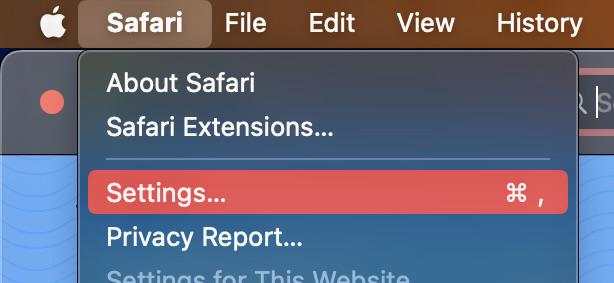
openning safari settings
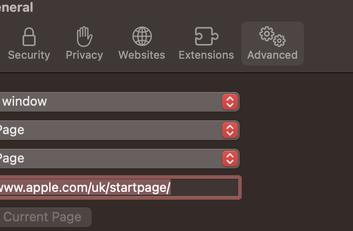
open advanced

Develop menu
- Open the Web Inspector: Go to Develop, click on “ Show Web Inspector. ”
Various options available in Developer mode:
Here are some of the key tools available in the developer mode of Safari browser:
The Inspector tool allows developers to examine and modify the Document Object Model (DOM) of a webpage. This helps in understanding the structure of the HTML and CSS, as well as making real-time changes to see their effects.
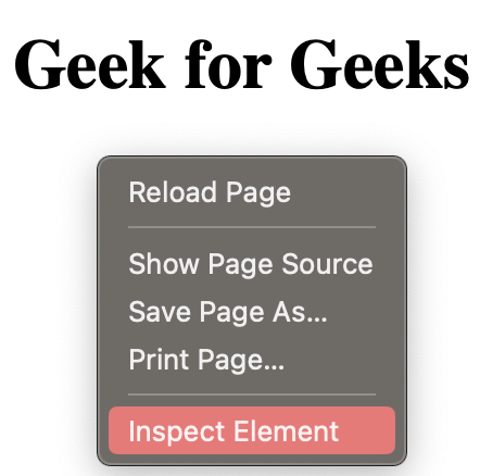
Inpecting Web page
The Console provides a JavaScript console for developers to log information, execute JavaScript code, and catch errors. It is a valuable tool for debugging scripts and testing code snippets.
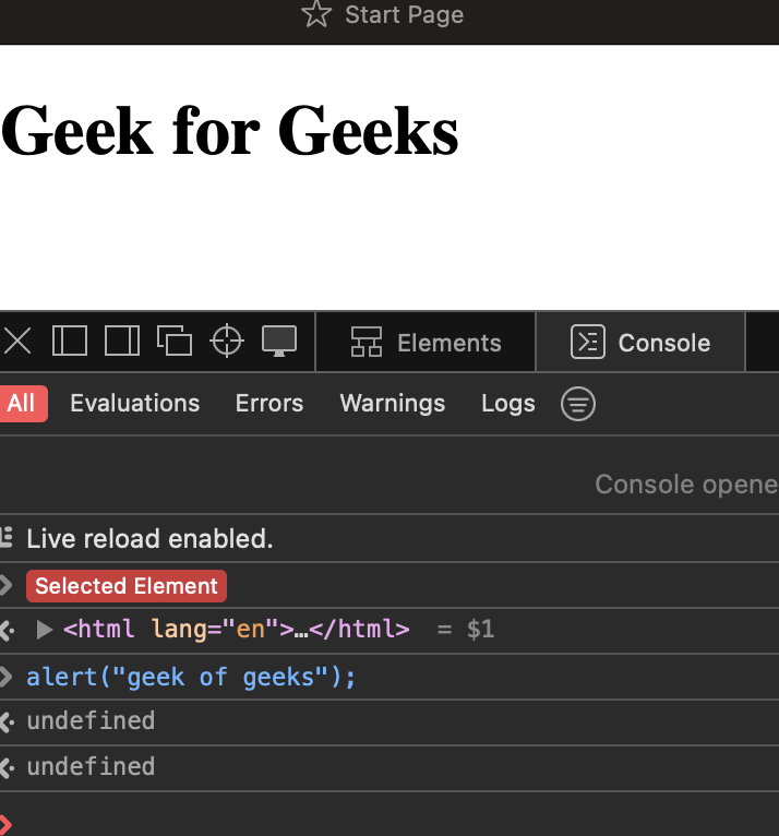
Console mode
This panel is an extension of the Inspector tool, providing a detailed view of the HTML and CSS elements on the page. Developers can modify styles, attributes, and content directly within this panel.
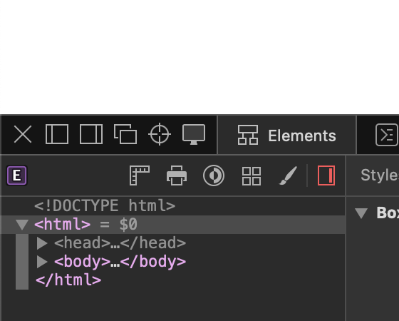
Elements tab
The Sources panel allows developers to debug JavaScript code. It includes features like breakpoints, stepping through code, and watching variables, helping developers identify and fix issues in their scripts.
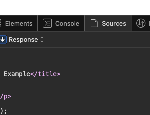
Sources tab
The Network panel provides insights into the network activity of a webpage, showing details of all resources loaded, their sizes, and loading times. This is crucial for optimizing page performance.
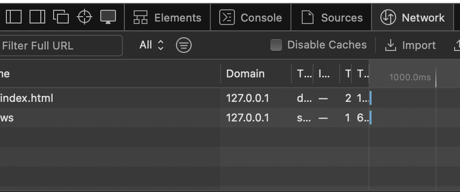
Network tab
The Timeline tool records and visualizes various events on a webpage, such as script execution, rendering, and painting. This helps developers identify performance bottlenecks and optimize their code.
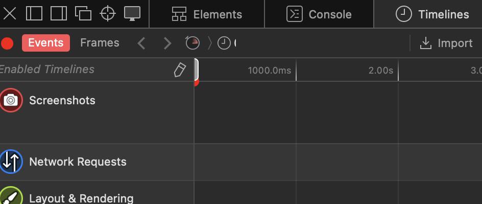
Timelines tab
The Storage panel allows developers to inspect and modify data stored by the website, including cookies, local storage, and session storage. This is useful for debugging and testing how a website handles data storage.

Storage tab
Now, let us look at a particular scenario where we will fix a problem with a web page using Safari Developer Mode. Imagine a case where the layout of a website gets altered because it has a problem relating to CSS style. The web inspector allows a person to pick out the bad part, inspect and fix the CSS properties in real time. Here’s a image showcasing this process:
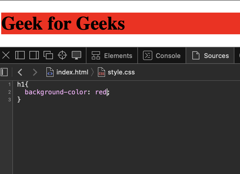
Web developers rely on Safari Developer Mode; it is a great tool with multiple features and functions vital for effective web development. For web developers, the Safari Developer Mode equipped with the Web Inspector forms an amazing partner that possesses a toolbox for creating, debugging, and optimizing websites. It goes through HTML, CSS, JavaScript, network performance, as well as responsive design. The suite facilitates convenient debugging, live testing, and diverse instrumentation. This touches on project development starting right at its conception, incorporating quality and responsiveness aspects in design. In brief, it is a point of reference for making beautiful and fast websites even at this digital world.
Please Login to comment...
Similar reads.

- Apple Safari
- Geeks Premier League 2023
- Geeks Premier League
- Web Browsers
- CBSE Exam Format Changed for Class 11-12: Focus On Concept Application Questions
- 10 Best Waze Alternatives in 2024 (Free)
- 10 Best Squarespace Alternatives in 2024 (Free)
- Top 10 Owler Alternatives & Competitors in 2024
- 30 OOPs Interview Questions and Answers (2024)
Improve your Coding Skills with Practice
What kind of Experience do you want to share?
How to Open Safari Developer Tools & Enable Mobile View Mode

John on May 12, 2021
In this tutorial, we will learn how to open the Safari developer console and enable mobile view for responsive web development.
How to Enable Safari Developer Tools
If you don't have developer tools enabled in Safari, you will need to do this before the console can be opened by using the following steps:
- From the main menu go to Safari > Preferences (or use the CMD + , keyboard shortcut.)
- Go to the Advanced tab.
- Check "Show Developer menu in menu bar"
Open the Safari Developer Console
Now open the developer console in responsive mode by going to the menu and selecting Develop > Enter Responsive Design Mode :
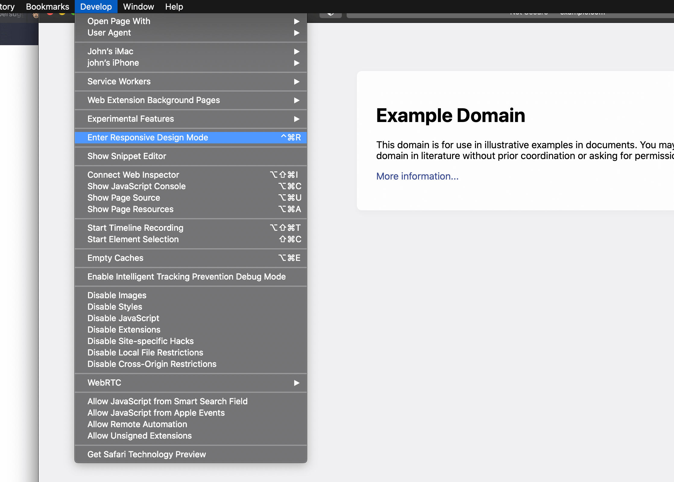
Alternatively, use the keyboard shortcut CTRL + CMD + R to enter responsive developer mode.
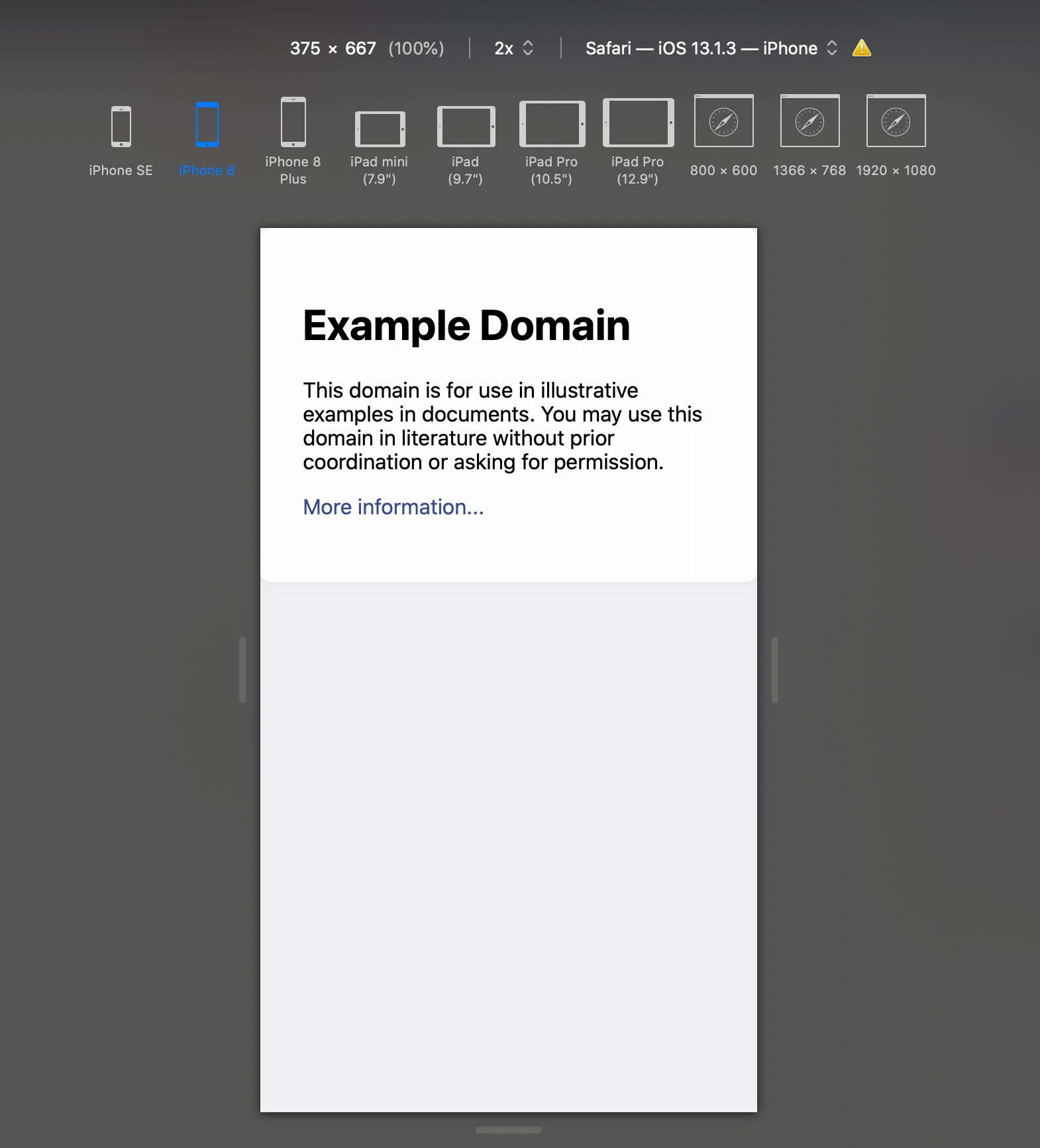
Now you can work on your website in a variety of different mobile device screen sizes by selecting them at the top of the page:
Related Tutorials

How to Stop DDOS Attacks & Prevent Future Downtime
-1589655824.jpg)
How to Enable Night Light Mode on Windows 10
How to View Desktop Site on iPhone with Safari

How to Use Grep Command to Search Files in Linux

How to Find Words on a Page using Safari on iPhone
How to Clear & Save Disk Storage Space on a Mac
📒 FREE FOCUS ASSESSMENT : All-New → Get Started!
Capture Your Ideas : Learn Ulysses → Brand New Course!
💌 NEW: Calm Inbox : Less Email, More Focus → Get Access
📒 NEW: 2023 Digital Planner : Made for iPad → Yes, Please!
FREE! Plan Your Ideal Week : Bonus Workshop + Planner → Get the Workshop
NEW! All the Things : Productivity Course → Check it Out
Productivity Workshop : The 4-Part Flywheel → GET ACCESS!
Bundle Up and Save : 25% discount on all app courses → Learn More
Simplify Your Time Management : New Course → Finally!
🧠 To Obsidian and Beyond : All-New Course → GET ACCESS

How to use Responsive Design Mode in Safari
Anyone that works with websites knows how important it is that they scale correctly on all types of devices. While mobile is extremely important, desktop is still a primary way that a lot of people experience the internet.
On the Mac, Safari makes it extremely easy to check websites across all types of devices and screen sizes. To do this, you need to enable the Developer menu. Click Safari → Preferences , and then click the Advanced tab. Enable the Show Develop menu in menu bar option in the Preferences dialog box.
One that is enabled, go to the Develop menu on the Safari menu bar. Click Enter Responsive Design Mode .
You’ll now see options for various iPhones, iPads, and desktop screen resolutions. This will allow you to make sure your websites look good for everyone , regardless of device choice.
We have more helpful tips right here .
Curated List of Must-Have Apps
We spend an inordinate amount of time sorting through hundreds of apps to find the very best. Our team here at The Sweet Setup put together a short list of our must-have, most-used apps in 2022.
You will get…
- The current list of The Sweet Setup’s top 8, must-have apps.
- A special, pro tip for each app to help you save time and become more of a power user.
- A hidden feature of each app that you may not have known about.
The Sweet Setup Staff Picks for 2022
These apps work on iPad, iPhone, and Mac. And they range across several different categories but are mostly focused on productivity. They will help you get the most out of your devices and your day.
Simplified Responsive Design Mode
Oct 5, 2023
by Jon Davis
Responsive design is a well-established practice of creating designs that adapt to different screen sizes. Gone are the days when you could create a new website designed for one screen size. Today’s devices are a menagerie of resolutions, from screens that fit on your wrist to the one you hold in your hand or rest on your lap, and even virtual screens that wrap around your entire field of vision.
There are so many screen sizes today that it’s made designing to a specific set of resolutions almost meaningless. Instead, we’re using powerful modern layout tools like Container Queries, Grid, and Flexbox to create fluid layouts so that designs can adapt to any screen size.
Creating resilient, adaptive designs requires tools that help you quickly explore your layouts in every resolution. Responsive Design Mode in Safari does just that. It gives you a fast preview of how your web page layout adapts to different viewport dimensions and aspect ratios in real time.
As part of the suite of developer tools, Responsive Design Mode is available when you enable Show features for web developers in Safari’s Advanced settings. Once enabled, you can jump into Responsive Design Mode for the currently focused tab or window by choosing Enter Response Design Mode from the Develop menu or pressing Command-Control-R (⌃⌘R).
With its streamlined design in Safari 17, Responsive Design Mode makes it faster and easier to test your designs.
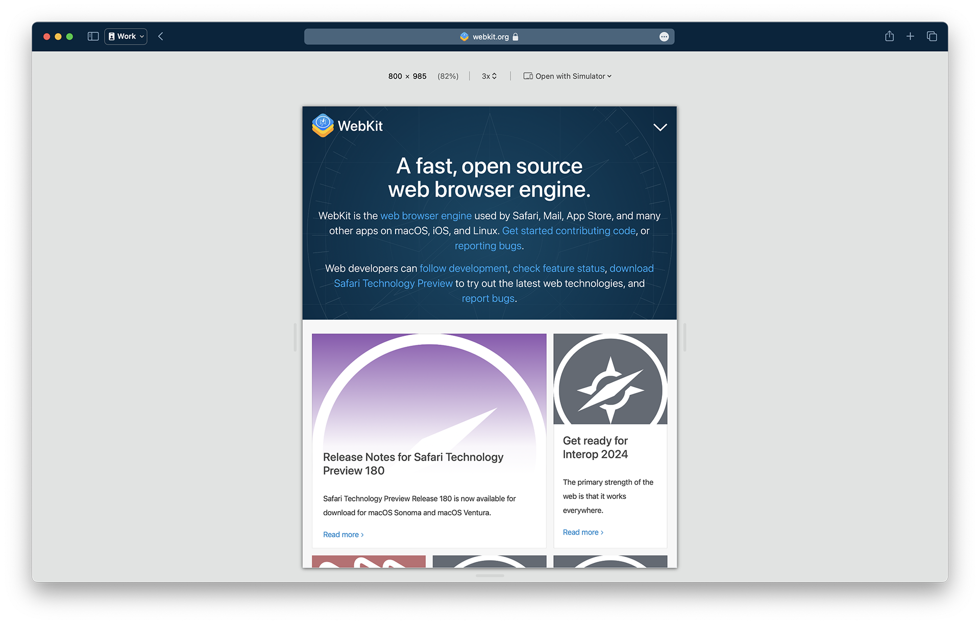
Notably, the row of device and window icons is gone, helping you focus on creating adaptive designs that fluidly respond to any screen size as the web moves away from rigid, resolution-specific designs.

Resizing is as easy as clicking the “handles” at any side of the viewport preview and dragging them to any size. You can watch the dimensions of the viewport change in the size display shown in screen point units at the upper-left.
You can even test viewport sizes beyond the size of the display you’re actively using. Keep dragging the handles, and the preview fluidly scales, showing the zoom level as a percentage of the actual size of the viewport. At 100%, each pixel of web content is visible in the preview. When the viewport grows to a size larger than the window size of Safari, the zoom level decreases, indicating the preview is scaled down to fit the available space in the window.
Pixel Density
Another dimension of screen size designers need to consider today is the pixel density of screens. Pixels have gotten much smaller on modern devices, affecting the pixel-based assets in your designs, like interface icons, photos, or videos. A menu next to the effective viewport dimension allows you to change the pixel ratio used in the preview. The 1x, 2x, and 3x settings help you test all the assets you went the extra mile to prepare to give your users the best experience regardless of their device capabilities.
Instead of generating each asset by hand, many folks opt to configure their build tools to automatically resize assets for the srcset attribute on image elements or the image-set() function in CSS to set the pixel ratio for a background-image .
Here, the pixel ratio control helps you ensure your tooling is configured correctly to generate all the needed assets.
In CSS you can use media queries to apply styles based on the pixel ratio of the display. For instance, you can set thinner lines on a 2x display:
The pixel ratio control also allows you to test those styles.
Responsive Design Mode shows you a good approximation of how your web page layout will be affected by viewport sizes. But iOS, iPadOS, watchOS, and visionOS have different rendering behaviors optimized to their form factors that are necessarily different than macOS.
Fast, real-time feedback is what makes Responsive Design Mode so helpful, but it comes with a tradeoff in accuracy. It’s a familiar problem in technology. For example, Xcode offers SwiftUI developers a preview mode that allows them to see the interfaces their code generates and even lets them interact with the interface in a limited capacity. But the complete experience requires building the project to see the result run in a simulator or on an actual device.
So now, it’s easy to jump into device simulators to try your site designs with the same full-fidelity experience as an actual device.
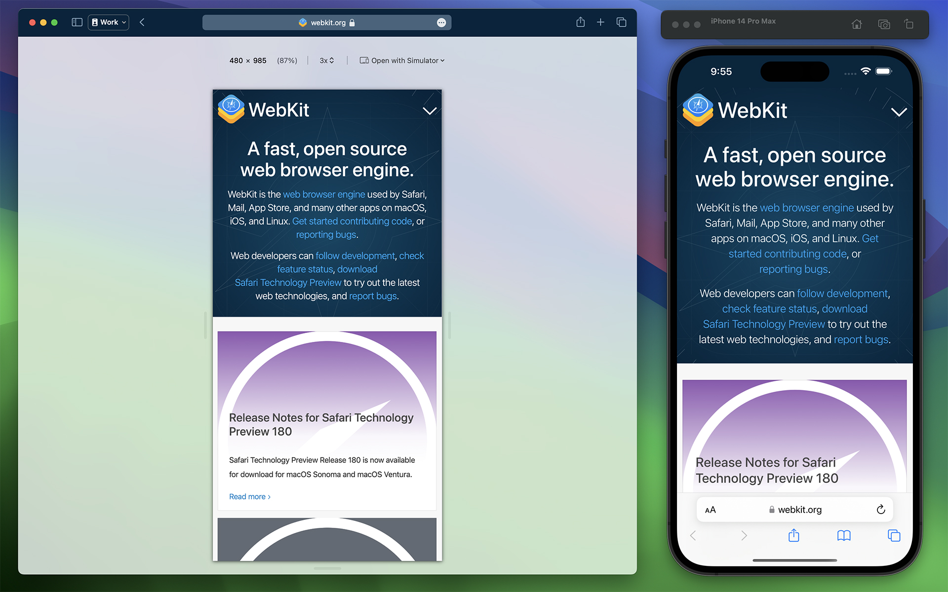
Responsive Design Mode offers a new Open with Simulator menu for quickly jumping into an Xcode device simulator for the current web page. It shows a list of suggested simulators, but many more are available than what’s listed. You’ll need to download and install Xcode from the App Store for free to run simulators. Selecting the Add simulators… option from the Open with Simulator menu will open a new tab in Safari with instructions on adding more simulators.
To get a more accurate idea of how your web pages will behave in those environments, you can use simulators without needing access to the devices themselves.
Web Inspector
Responsive Design Mode becomes an even more powerful tool when combined with Web Inspector. It allows you to find the source of layout issues while resizing the page or adjusting the pixel ratio. With developer features enabled, select Show Web Inspector from the Develop menu or press Command-Option-I (⌥⌘I).
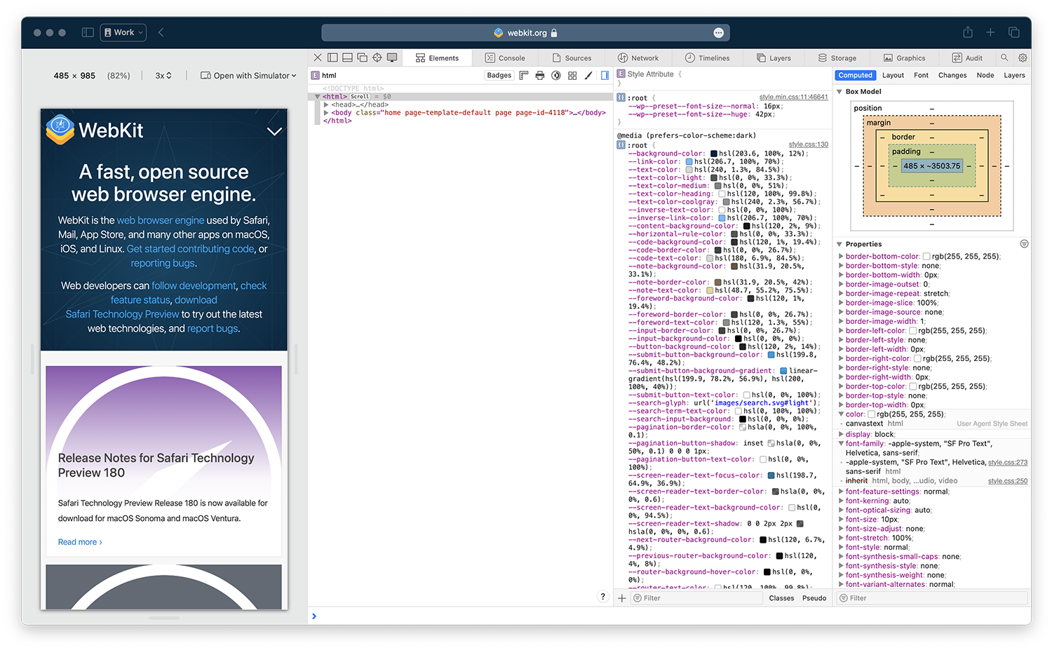
When debugging narrow viewport sizes, you might find it helpful to click the Dock to left or Dock to right button in Web Inspector to put it side-by-side with the preview viewport.
The updated Responsive Design Mode distills the tools to the essentials for quickly assessing the layout of your web pages at any screen size. It gives you at a glance access to layout issues and accelerates testing your pages in a variety of device-accurate simulators.
We love to hearing from you. Send a tweet to @webkit to share your thoughts Responsive Design Mode. Find us on Mastodon at @[email protected] and @[email protected] . If you run into any issues, we welcome your feedback on Safari UI like Responsive Design Mode, or your WebKit bug report about web technologies or Web Inspector. Reporting issues makes an enormouse difference.
Download the latest Safari Technology Preview to stay at the forefront of the web platform and to use the latest Web Inspector features.
- Data Engineering
- Machine Learning
- RESTful API
- React Native
- Elasticsearch
- Ruby on Rails

How To Debug Websites Using Safari Developer Tools
Safari is the default browser on iPads, Macbooks, and iPhones. It lies second on browser preferences right after Chrome. Its 250+ features offer users striking benefits that set it apart from other most popular browsers like Chrome and Firefox. Building on that, iPhone’s popularity has resulted in a global smartphone market share of 53.6% for Safari.
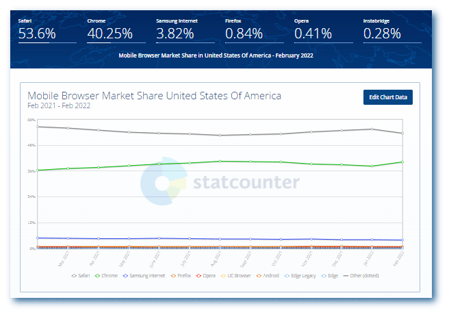
Last year, Apple’s number of active devices witnessed a significant increase to 1.5. Since the user base keeps rising, Apple constantly ensures a near-perfect user experience and an optimized performance across all its devices.
Thanks to its good usability and the massive popularity of Apple devices, Safari has gained a broad user base. If that’s the case, it’s vital to offer them an ideal browsing experience across various browser versions. But once you go ahead and launch a website, debugging it after encountering a bug becomes almost impossible.
That’s why it’s crucial to debug websites for Safari before they go out there. In this article, we look at how to debug websites using Safari Developer tools.
But before that, let’s check out why it’s vital to debug websites on Safari.
Why debug websites on Safari?
Safari has been a part of the most popular browsers since 2003. Its first version was released the same year with Mac OS X Panther. Since the iPhone launched in 2007, a mobile version of Safari has been included in all iOS devices. If a user doesn’t change it, it’s the default browser on Apple devices.
Considering the number of Apple devices and their never-ending versions, the combinations of different features and screen resolutions are enormous. But when you debug websites on Safari before launch, your users can hop on to the Window that quickly takes them to your services and products.
Web developers must validate website appearance across different screen sizes to maintain cross browser compatibility . This ensures the correct rendering of web pages across various browsers. It also provides a comparatively superior user experience with consistency. It’s also essential to consider how a particular version of Safari might interact with a device’s hardware specifications. This adds to another form of verification that is crucial for the web development pipeline.
Since Safari is the second most popular browser, businesses shouldn’t risk losing out on potential customers because of website bugs. After all, vulnerability, compromised navigation, and other incompetencies can turn a simple user interface into a screaming nightmare!
On the upside, device functionality and operating system are more superficial than Android devices. According to QA, deciding on a testbed is straightforward too.
Different methods to debug websites using Safari Developer tools
Before debugging websites using Safari Developer tools, it’s essential to have a device that runs on iOS or macOS. This section will explore three different techniques to debug websites using Safari Developer tools.
Debug Using Responsive Design Mode in Safari Developer tools.
Debug Websites on Safari using Web inspector on iPhones and iPads.
Debug Websites using Safari Developer tools on the LambdaTest platform.
Remote debugging for iOS Safari on OS X
Let’s take a look at different methods one by one!

Debugging websites with Responsive design mode
In this section of the article on Developer tools for Safari, we will look at how you can debug the mobile view of a website using Safari Developer tools. Remember that you need to enable the Developer menu before accessing the responsive design mode since it’s disabled by default for Safari.
After launching the Safari browser, select Preferences > Advanced .
Check the box and click the Show Develop menu in menu bar .
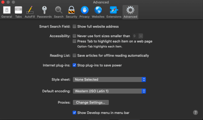
Here is how it looks.
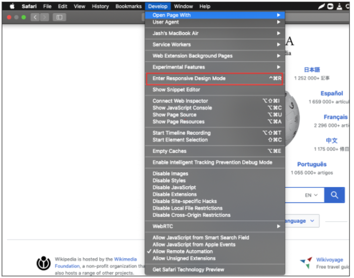
Below are the steps for viewing a website’s mobile version with the help of Safari Developers tools –
Launch Safari and visit the URL of your choice.
Go to Develop > Enter Responsive Design Mode from the menu bar.
After that, you can view the desired website by selecting the Apple mobile device.
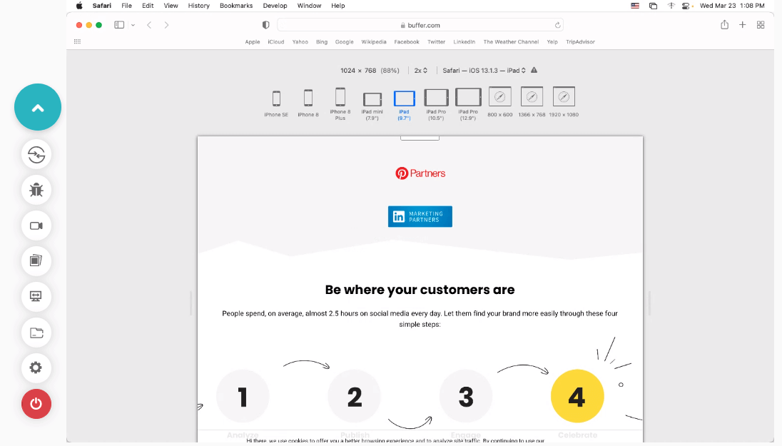
- If you wish to debug a particular issue for a specific viewport or screen size or inspect a particular element, Web Inspector is the key to doing it. Developers can find it in the development view and use the element selector to inspect specific elements after activating the inspector.
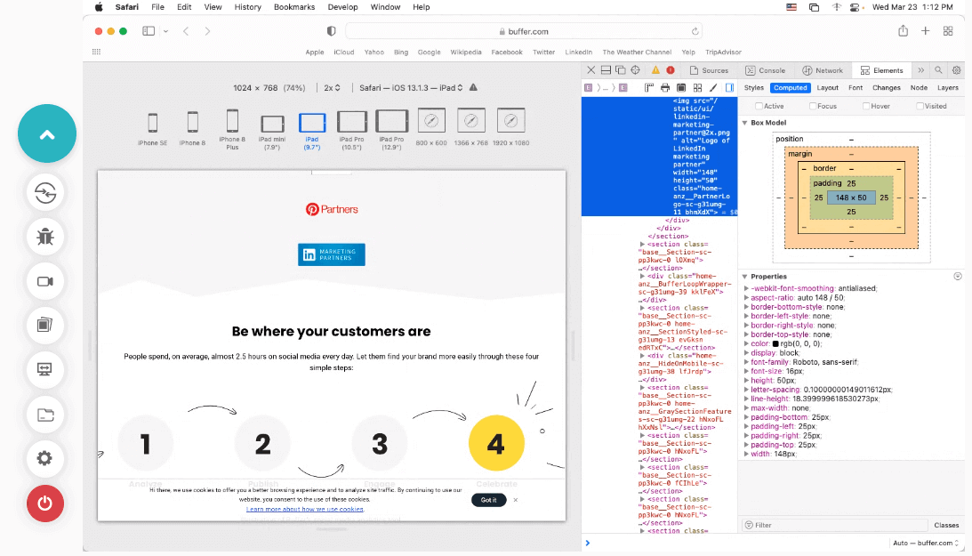
Debugging websites on Safari using Web Inspector
As mentioned in the above method, here is how you can easily debug websites on iPhone and iPads on Safari using the Web Inspector.
Let’s take a look.
Connect your iPad or iPhone to the machine.
Navigate to Settings > Safari > Advanced and enable the Web Inspector toggle button.
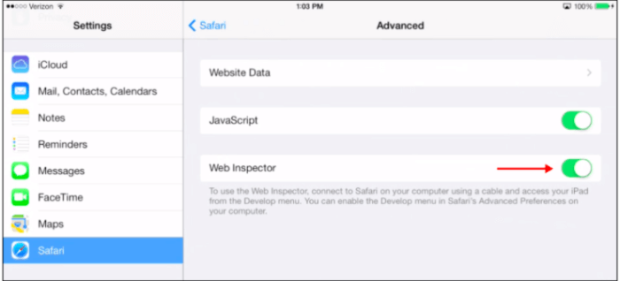
You can now preview the desired web page on your Safari browser in mobile or start debugging using Safari Developer tools.
Debugging websites using Safari Developer tools on LambdaTest
Cross browser testing platforms like LambdaTest provides integrated Safari Developer tools that allow users to debug websites in real-time on iOS simulators for browser testing. It also enables devs and testers to test on Safari browser online across different real Safari browser versions and operating systems. They can easily view and debug any JavaScript, CSS, or HTML web applications or websites and check their sites through changes in code via developer tools across different iOS devices.
Why Use LambdaTest for Safari Browser Debugging?
LambdaTest is a cross browser testing platform that offers an online browser farm of 3000+ real browsers and operating systems to perform browser and app testing of websites and web applications. Therefore, you can perform web testing on different versions online for identifying browser compatibility issues. In addition, it facilitates browser testing on real Safari browsers online that run on real machines. This ensures website compatibility on all legacy Safari versions and new ones from Safari 15 to 5.1.
Users get a broad range of Safari browser versions for debugging, ensuring a pixel-perfect experience for customers. In addition, thanks to parallel testing, LambdaTest helps you reduce test execution time for testing your website on both mobile and virtual macOS online.
The best thing about the LambdaTest platform is that you don’t even have to install or download anything, not even virtual machines! The cloud grid of mobile Safari browsers allows users to run Selenium IDE tests on cloud.
Also, with LambdaTest integrations, you can directly mark your bugs from LambdaTest and use Asana, JIRA, or other bug management tools. In addition to that, users can also move them to Gitlab, GitHub or carry out communication over Slack. Other integrations include Mantis Bug tracker, Clubhouse, Bugherd, TeamWork, Paymo, VSTS, and BitBucket.
LambdaTest tunnel allows users to access online Safari browsers for local page testing of private or locally hosted web apps for browser compatibility on different Safari browsers. Single-click responsive testing and full-page screenshot testing are some added functionalities.
Below are the steps on using iOS Developer tools for Safari on the LambdaTest platform for real-time testing –
Login to your LambdaTest account. If you don’t have an account, register on LambdaTest .
If you want to test on emulators and simulators , select **Real Time Testing **from the left sidebar. To test on a real device cloud , choose Real Time from the Real Device dropdown.
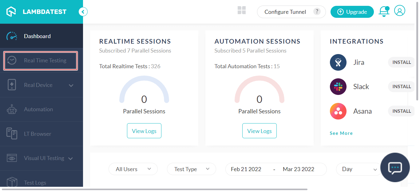
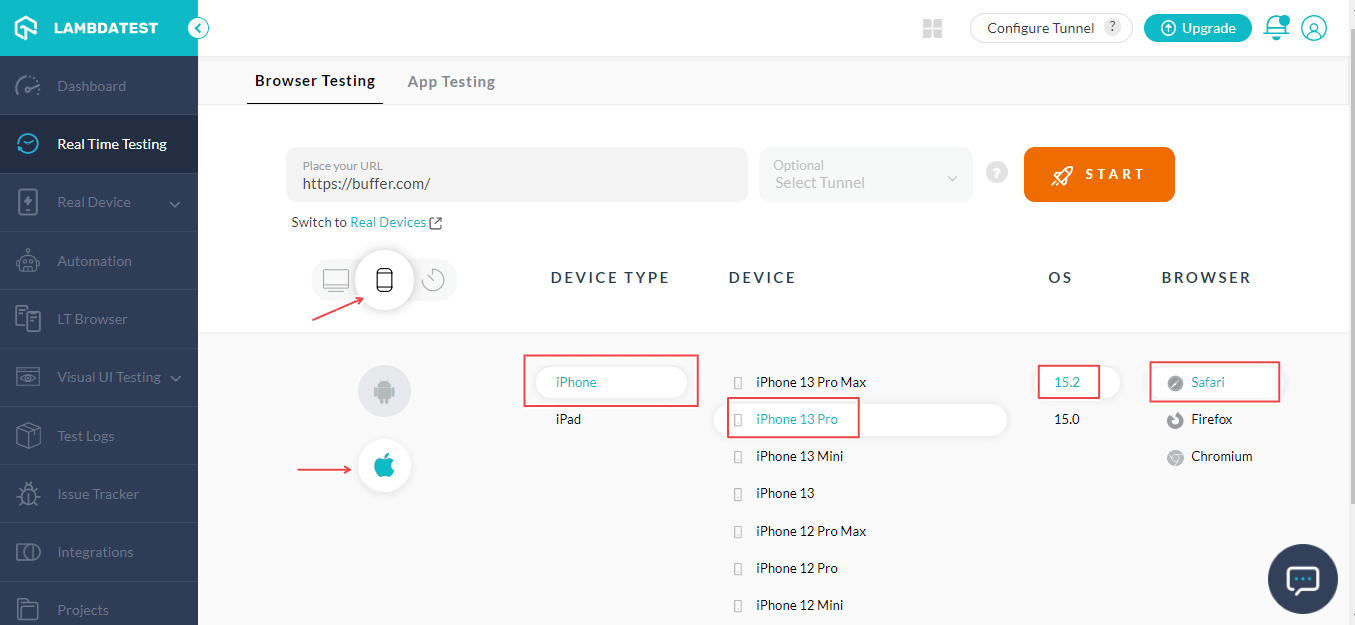
- Enter a test URL, select the Mobile OS icon, choose DEVICE TYPE , DEVICE , OS , and BROWSER . Then, click START .
- It will route you to the selected cloud-based iOS simulator . To open the integrated Safari Developer tools, click the **DevTools **icon.
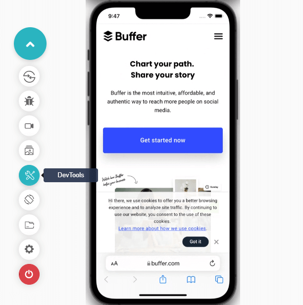
You can now debug your web applications or websites using Developer tools for Safari.
If you want to debug websites on real devices, here is a quick tutorial on performing real-time testing on real devices.
Remote debugging iOS Safari on OS X can be a challenging task. But it’s simpler than you might think. First, install the Safari browser version on your computer.
Connect an iPhone or iPad to a Mac computer with the help of a USB.
Enable Web Inspector on your device by selecting Settings > Safari > Advanced and switching on the Web Inspector toggle. This will switch it on in case that wasn’t in the default mode.
After successfully enabling Web Inspector, do the same with the develop menu by selecting Safari > Preferences > Advanced and check the box in the menu bar. Don’t do anything if it’s enabled already by default.
Ensure that your devices are plugged in on your computer before opening your desired web page. Select Develop > iOS device name and select the page you wish to debug.
Now, you can view and update the DOM (Document Object Model) and have access to the JavaScript console and some other features and options.
The reason for the Javascriptexecution failure is generally provided in the error message, including a stacktrace of the error given by the browser’s JavaScript engine.
Summing Up!
You won’t automatically gain a billion users by designing a feature-filled website. Even if you manage to acquire people to browse your website with compromised features, they will encounter bugs and leave your platform forever. Remember that retention is vital to ensure consistent conversions and high ROI besides gaining users. Every bug in your interface takes your customers closer to your competitors.
The methods mentioned above are helpful for QA teams to debug websites using Safari Developer tools. Interface bugs can lie on the spectrum of simply being annoying and causing major user experience disruptions. Debugging on Safari browsers is necessary to launch web applications that work well under all conditions.
Some developers and testers might find website debugging for Safari a bit challenging. But it’s important to remember how crucial it is to offer a satisfying and seamless user experience for better customer acquisition and retention.
Do you have any questions regarding how to debug a website using Safari Developer tools? Let us know in the comments below.
Enjoy this post? Give VeetheeDixit1 a like if it's helpful.
Leave a like and comment for VeetheeDixit1

How To Activate And Use Responsive Design Mode In Safari
Published: August 4, 2023
What is Responsive Design Mode?
Responsive Design Mode is a feature in the Safari browser that allows web developers and designers to easily test and optimize the appearance of their websites on different screen sizes and resolutions. With the growing popularity of mobile devices and the diverse range of screen sizes available today, it has become crucial for websites to be adaptive and responsive to provide an optimal user experience.
Responsive Design Mode enables developers to simulate different screen sizes, from smartphones and tablets to laptops and desktops, without the need for physical devices. This feature provides a convenient and efficient way to ensure that a website is accessible and visually pleasing on various devices, allowing developers to identify and fix any layout or design issues that may arise.
By activating Responsive Design Mode, web professionals can put themselves in the shoes of their target audience and gain valuable insights into how their websites perform across different platforms. It enables them to see exactly how their content is displayed and how the website reacts to changes in screen size, allowing for quick adjustments and optimizations.
This feature is particularly beneficial for businesses and individuals who aim to reach a wider audience and improve user engagement. It helps ensure that the website content is easily readable, the images are appropriately sized, and the overall user experience is consistent and seamless across different devices.
Responsive Design Mode also aids in keeping up with the ever-evolving digital landscape, where new devices and screen sizes are constantly being introduced. It allows developers to adapt their websites to the latest trends and technologies, offering an enhanced browsing experience to visitors regardless of the device they are using.
Why is Responsive Design Important?
Responsive design is a critical aspect of modern web development that ensures websites are accessible and usable across different devices and screen sizes. Here are some reasons why responsive design is important:
1. Improved User Experience: Responsive design ensures that users can easily navigate and interact with a website regardless of the device they are using. It provides a consistent and seamless experience, allowing visitors to access information and functionalities without any barriers or frustrations.
2. Increased Mobile Traffic: With the significant rise in mobile usage, having a responsive website is crucial to accommodate the growing number of visitors accessing the internet through smartphones and tablets. By optimizing for mobile devices, businesses can tap into the ever-expanding mobile market and attract more potential customers.
3. Better SEO Performance: Search engines prioritize responsive websites when ranking search results. Having a mobile-friendly and responsive design improves the website’s visibility and increases the chances of appearing higher in search engine rankings. This, in turn, drives more organic traffic to the site and boosts its overall online presence.
4. Cost-Effectiveness: Instead of maintaining separate websites for desktop and mobile devices, responsive design allows for a single website that adapts seamlessly to different screen sizes. This reduces the development and maintenance costs associated with managing multiple versions of a website, making it a more cost-effective solution.
5. Future-Proofing: Responsive design ensures that your website is prepared for future technological advancements and changes in user behavior. As new devices with varying screen sizes and resolutions emerge, a responsive website can easily adapt and provide an optimal experience, without the need for major redesigns or updates.
6. Competitive Advantage: With more businesses recognizing the importance of responsive design, it has become a standard expectation for users. Having a responsive website sets you apart from your competitors and showcases your commitment to providing a user-friendly experience, potentially influencing customer perception and driving more conversions.
In a digital landscape that is constantly evolving, responsive design has become a necessity rather than a luxury. It ensures that websites remain functional, accessible, and visually appealing across a wide range of devices, leading to improved user engagement, increased traffic, and enhanced business success.
How to Activate Responsive Design Mode in Safari
If you’re using Safari as your preferred web browser for testing and optimizing your website’s responsiveness, activating Responsive Design Mode is a simple process. Here’s a step-by-step guide:
1. Open Safari Developer Tools: To access the developer tools, go to the Safari menu (located in the top-left corner of your screen) and click on “Preferences.” In the Preferences window, select the “Advanced” tab, and check the box next to “Show Develop menu in menu bar.”
2. Enable Developer Tools: In the Safari menu, you will now see a new option called “Develop.” Click on it to expand the dropdown menu.
3. Activate Responsive Design Mode: In the Develop menu, click on “Enter Responsive Design Mode” or use the keyboard shortcut “Command + Option + R” (for Mac) or “Ctrl + Shift + R” (for Windows).
4. Select a Device: Once you have activated Responsive Design Mode, you will see a toolbar at the top of the screen with various device options. Click on the menu to choose the screen size and device you want to simulate. Safari offers a range of predefined options, including popular iPhone and iPad models, as well as other common screen sizes.
5. View Your Website: After selecting the desired device, Safari will display your website in Responsive Design Mode, simulating the chosen screen size. You can now observe how your website appears on different devices and make necessary adjustments to optimize its responsiveness.
6. Customize Screen Size: If the predefined options do not match the specific screen size you wish to test, you can enter custom dimensions in the toolbar. Simply click on the width and height fields and input the desired measurements. This allows you to test your website on unique screen sizes and resolutions.
7. Toggle Device Orientation: Responsive Design Mode also enables you to test how your website adapts to changes in device orientation. To switch between portrait and landscape modes, click on the corresponding button in the toolbar.
8. Exit Responsive Design Mode: To exit Responsive Design Mode and return to the regular browsing mode, go back to the Develop menu and click on “Exit Responsive Design Mode.” Alternatively, you can use the keyboard shortcut “Command + Option + R” (for Mac) or “Ctrl + Shift + R” (for Windows) again.
Activating Responsive Design Mode in Safari empowers web designers and developers to evaluate and optimize their websites for various devices and screen sizes. By using this feature, you can ensure a seamless and visually appealing user experience across different platforms.
Using the Device Toolbar in Responsive Design Mode
Once you have activated Responsive Design Mode in Safari, you can take advantage of the powerful Device Toolbar to further enhance the testing and optimization of your website’s responsiveness. Here’s how you can make the most out of this feature:
1. Viewport Dimensions: At the top of the Device Toolbar, you will find the viewport dimensions. This displays the width and height of the simulated device screen. You can adjust these dimensions by clicking on the input fields and entering custom values. Experimenting with different viewport sizes allows you to see how your website adapts to various screen resolutions.
2. Device Selection: The Device Toolbar offers a wide range of popular device options to simulate. From iPhones and iPads to Android devices and desktop screens, you can choose the device that closely matches your target audience’s preferences. This helps you accurately test how your website looks and functions on different devices.
3. Device Orientation: The Device Toolbar also allows you to switch between portrait and landscape modes. By clicking on the device orientation icons (such as a portrait or landscape icon), you can assess how your website responds to changes in screen orientation, ensuring a seamless user experience in both modes.
4. Touch Navigation: To simulate touch interactions on mobile devices, the Device Toolbar provides intuitive touch gestures. You can use the virtual touchscreen to scroll, pinch-to-zoom, swipe, and perform other common touch actions. This allows you to assess the usability and functionality of your website on touch-enabled devices.
5. Network Conditions: In addition to device simulations, Safari’s Device Toolbar helps you evaluate how your website performs under different network conditions. By selecting various network presets, such as 3G, 4G, or a specific connection speed, you can observe how your website loads and functions in different network environments.
6. Debugging Options: The Device Toolbar also provides access to additional debugging features. By enabling options like continuous repainting, color profiling, and GPU rendering, you can identify potential performance issues and optimize your website for improved speed and efficiency.
7. Device Metrics: As you adjust the viewport dimensions and test your website on different devices, the Device Toolbar provides real-time feedback on various metrics. This includes details such as device pixel ratio, CSS pixels, and scale factors. These metrics offer valuable insights into how your website is rendered on different screens and help ensure accurate rendering and crisp graphics.
The Device Toolbar in Responsive Design Mode is a valuable tool for web developers and designers. It allows for comprehensive testing and optimization of your website’s responsiveness, ensuring a seamless user experience across a variety of devices and network conditions. By utilizing the Device Toolbar, you can confidently create websites that are user-friendly, visually appealing, and optimized for maximum engagement.
Testing Different Screen Sizes in Responsive Design Mode
Responsive Design Mode in Safari provides an excellent platform for testing your website’s responsiveness across various screen sizes. By simulating different devices and resolutions, you can ensure that your website looks and functions optimally on any screen. Here’s how you can effectively test different screen sizes:
1. Device Emulation: In Responsive Design Mode, select different devices from the Device Toolbar to emulate their specific screen sizes. This allows you to evaluate how your website appears on popular devices such as iPhones, iPads, Android phones, and desktop screens. By testing on a range of devices, you can identify potential issues and make necessary adjustments to optimize the user experience.
2. Custom Viewport Sizes: Besides predefined device options, you can also enter custom viewport sizes in the Device Toolbar. This flexibility enables you to test your website on unique screen dimensions and resolutions. It is particularly useful when targeting specific devices or catering to niche audiences with non-standard screen sizes.
3. Responsive Layout: While testing different screen sizes, pay close attention to your website’s layout. Check how the elements reposition or adapt to fit smaller or larger screens. Ensure that important content remains easily accessible, text remains readable, and images are appropriately scaled. Make any necessary adjustments to maintain a consistent and intuitive user experience across all screen sizes.
4. Navigation and Interactivity: Test the navigation and interactive elements of your website on different screen sizes. Evaluate whether menus, buttons, and links are easily clickable and accessible. Verify that dropdown menus function properly and expand or collapse as intended. Aim for a seamless user experience across all devices, minimizing the need for excessive scrolling or zooming.
5. Media Queries and Responsive Images: Ensure that your website is utilizing media queries effectively. Media queries allow you to apply specific CSS styles based on screen size, enabling a tailored display for different devices. Test how your website responds to changes in screen size, and verify that responsive images load appropriately to enhance the visual experience without slowing down page load times.
6. Performance and Loading Times: Test the performance of your website on different screen sizes. Monitor loading times and performance indicators, such as page speed and resource usage. Optimize your website’s code, minimize HTTP requests, and consider using techniques like lazy loading to ensure efficient resource loading and a smooth user experience across devices.
7. User Testing: Don’t rely solely on Responsive Design Mode for testing. Involve real users on different devices to provide feedback on their experience. Conduct user tests and gather valuable insights on how your website functions in real-world scenarios. Their feedback can help you further refine the responsiveness of your website.
By thoroughly testing your website on different screen sizes, you can identify any issues or inconsistencies and address them promptly. This ensures a seamless and enjoyable user experience for visitors, regardless of the device they are using to access your website.
Modifying CSS in Responsive Design Mode
In Responsive Design Mode, Safari offers the ability to modify the CSS (Cascading Style Sheets) of your website on the fly. This feature allows you to make real-time adjustments to the appearance and layout of your site, enabling you to fine-tune its responsiveness. Here’s how you can effectively modify CSS in Responsive Design Mode:
1. Inspect Elements: Use the Inspect Element feature to identify the HTML elements that you wish to modify. Right-click on the element and select “Inspect Element” from the context menu. This will open the Developer Tools panel, showing the HTML and CSS associated with the selected element.
2. Experiment with CSS Properties: In the Styles tab of the Developer Tools panel, you can modify CSS properties to change the appearance of elements on your website. Try adjusting properties such as font size, color, padding, margin, and width. As you make changes, observe how they affect the layout and responsiveness of the page.
3. Responsive Media Queries: Modify media queries to optimize your website’s responsiveness for different screen sizes. Experiment with breakpoints and viewport widths to see how your website adapts to different devices. Adjust styles within media queries to ensure that content is displayed appropriately and that the user experience remains seamless across a range of screen sizes.
4. Test Different Device Orientations: Use the Device Toolbar to switch between portrait and landscape orientations. Modify CSS properties accordingly to ensure that your website adjusts and displays properly in each orientation. It is essential to verify that text, images, and other elements are positioned correctly and remain readable regardless of the device orientation.
5. Live Preview: Safari’s Responsive Design Mode allows you to see your CSS modifications in real-time. As you make changes to the CSS properties, the website preview updates instantly, providing immediate feedback on how your modifications affect the layout. This live preview feature speeds up the process of fine-tuning your website’s design and responsiveness.
6. Take Notes: Keep track of the CSS modifications you make, especially if you are testing multiple scenarios or experimenting with different breakpoints. Taking notes allows you to remember the changes you have made and revert them if needed. It also helps you track the modifications that work well and contribute to improved responsiveness.
7. Debugging CSS: In addition to modification, Responsive Design Mode helps you identify and debug CSS issues. If you encounter layout problems or inconsistencies, use the Developer Tools panel to inspect the CSS properties, identify conflicting styles, and make necessary adjustments to rectify the issues.
Modifying CSS in Responsive Design Mode provides a valuable opportunity to fine-tune your website’s responsiveness and visual presentation. By experimenting with different CSS properties and media queries, you can ensure that your website looks and performs optimally across various devices and screen sizes.
Inspecting Elements in Responsive Design Mode
In Responsive Design Mode, one of the powerful features available is the ability to inspect elements on your website. This capability allows you to dive into the structure and styling of individual elements, aiding in the debugging and optimization of your website’s responsiveness. Here’s how you can effectively inspect elements in Responsive Design Mode:
1. Accessing the Inspector: To inspect elements, right-click on the page and select “Inspect Element” from the context menu. Alternatively, you can use the keyboard shortcut “Command + Option + I” (for Mac) or “Ctrl + Shift + I” (for Windows).
2. Element Highlighting: As soon as you open the Inspector, the element under your cursor will be highlighted in the page’s HTML structure. This highlighting helps you identify the specific element you want to inspect and modify.
3. View and Modify CSS: Within the Inspector, you can view and modify the CSS properties associated with the selected element. By exploring and modifying the CSS rules, you can experiment with different styles and test their impact on the element’s appearance and layout.
4. Box Model Visualization: The Inspector provides a visual representation of the box model for elements, illustrating the size, padding, margin, and border properties. Understanding and adjusting these properties helps control the space and positioning of elements, making them more responsive and aesthetically pleasing.
5. Style Inheritance: In Responsive Design Mode, you can observe how styles are inherited from parent elements and adjust them accordingly. By inspecting elements and their parent hierarchies, you can identify and modify inherited styles to ensure consistency and responsiveness across your website.
6. DOM Tree Navigation: The Inspector displays the DOM tree, representing the hierarchical structure of elements on the page. This feature allows you to navigate through the elements and inspect their properties and styling. Understanding the relationship between elements aids in identifying and solving responsiveness issues.
7. Event Listeners: Use the Inspector to analyze event listeners attached to elements, such as click or hover events. Examining the event listeners helps in understanding the interactivity and functionality of your website. You can also simulate events to test how elements behave in different scenarios.
8. Accessibility Evaluation: In Responsive Design Mode, the Inspector provides insights into the accessibility properties of elements. You can review and enhance the accessibility of your website by inspecting ARIA attributes, labels, and other accessibility-related properties.
By inspecting elements in Responsive Design Mode, you gain a deeper understanding of your website’s structure, layout, and styling. This knowledge helps you identify and address responsiveness issues, optimize the user experience, and ensure that your website appears and functions flawlessly across various devices and screen sizes.
Best Practices for Using Responsive Design Mode in Safari
When utilizing Responsive Design Mode in Safari to test and optimize the responsiveness of your website, following these best practices can help ensure a smooth and efficient process:
1. Start with a Mobile-First Approach: Design and develop your website with a mobile-first mindset. Begin by optimizing your site for smaller screen sizes and gradually enhance the layout and elements for larger screens. This approach ensures a solid foundation for responsiveness.
2. Test on Real Devices: While Responsive Design Mode provides a convenient way to simulate different screen sizes, it is important to also test your website on actual devices. Emulators and simulators cannot perfectly replicate the behavior and performance of physical devices, so testing on real devices is essential for accurate evaluation.
3. Embrace User-Centric Design: Consider the needs and expectations of your target audience when optimizing for responsive design. Ensure that the user experience is intuitive, with easily accessible menus, clear navigation, and readable content across different screen sizes and orientations.
4. Prioritize Performance: Pay attention to the performance of your website, particularly on mobile devices. Optimize images, minimize code and resource sizes, and use caching techniques to enhance loading speeds. Responsive design should not sacrifice performance, so monitor and improve website performance regularly.
5. Validate and Optimize HTML and CSS: Use HTML and CSS validators to identify and fix any errors or warnings. Ensure that your code adheres to best practices and follows web standards. Optimizing and maintaining clean code helps prevent rendering issues and improves the overall responsiveness of your website.
6. Test Different Content: Test your website with a variety of content, including different image sizes, text lengths, and media types. This allows you to optimize the responsiveness of your website to accommodate various content scenarios without sacrificing user experience or visual appeal.
7. Accessibility Considerations: Ensure that your website is accessible to all users, regardless of their abilities. Adopt accessible design practices, such as providing alternative text for images, using proper semantic markup, and leveraging ARIA (Accessible Rich Internet Applications) attributes. Test your website’s accessibility in Responsive Design Mode to ensure it meets WCAG (Web Content Accessibility Guidelines) standards.
8. Monitor Analytics: Use analytics tools to track user behavior and engagement on your responsive website. Analyze data on device usage, screen sizes, and conversions. This helps you identify potential improvements and make data-driven decisions for further optimization.
By following these best practices, you can leverage Responsive Design Mode in Safari effectively to test and improve the responsiveness of your website. Ensuring an optimal user experience across devices will contribute to increased user engagement, improved search engine rankings, and overall business success.
Related Stories
Browsing Privacy: Disabling Incognito Mode On IPhone 11
Should I Upgrade To MacOS Monterey?
What Is Safari?
Chrome Journeys Might Be Enough To Tempt You Away From Safari
How To Control iPhone Safari Settings And Security
Privacy Management: Clearing Cookies On IPhone 13
Keep Your IPad Running Efficiently
How To Activate The IPhone Debug Console Or Web Inspector

The Benefits of E-Transfer Loans

Making The Right Choice While Buying A Property

The Power of Hobbies: Pursuing Passions for Mental Health

What Are the Top Mistakes to Avoid When Choosing a Drug Possession Defense Attorney?

Why Is Securing a Lawyer for Long-Term Disability Claims Crucial for Your Future?

Top 100 Christmas Songs for the Best Christmas Music

The Life and Career of Dean Haglund: A Journey from Canada to the Paranormal and Beyond

16 Best Ad Blocker For Every Browser and Device

Different Types of Aesthetics: 30 Outfit Ideas to Step Up Your OOTD Game

Watch Guide: 20 Best Limited Series on Netflix
Safari Responsive Design Mode Simulators are not showing up.
I have simulators downloaded to my 14" M2 Pro Macbook Pro, and for some reason, I cannot see any simulators as an option in Safari's Responsive Design Mode.
Am I missing something obvious, or is my computer bugged?
Above is an image of the Responsive Design Mode showing no simulators. I would offer more screenshots to prove that I have simulators installed, but it won't let me upload any more photos for some reason.
- Safari Developer Tools
The simulators can be installed by installing Xcode.
However, compared to previously, it's so much more cumbersome to quickly test, inspect and debug different viewports for devices now.
Previously we had a set of device icons that you could click and this was great. Please bring that back.
I agree with every web developer in this forum. Bring back the Responsive Design Mode simulators. Why do Apple programmers try to simplify things by making them more difficult???
APPLE, please bring back the good. Developers are really disappointed.
Please notify me when you've added them back to Safari.
This is just horrible. I wonder if the removal of the simulators was to improve the performance of the browser. Who am I kidding, Apple just want us web developers to us some subset of Xcode for analytics, more disk space so we can get that sweet iCloud+, and lower the performance of my machine so I buy a new one. What a shame.
Hello, you're not the only one troubled by this issue. As a web developer, I'm disappointed and, at the same time, furious. The Safari console has always been the best for me, and removing this option is absurd.
I use it for work every day, and now I'm out of luck. I've tried other browsers, and it works great everywhere else, but in Safari, they've unfortunately completely ruined it.
I don't know what to do. It's nonsense, and simulating through Xcode doesn't make sense. I don't want to open another window; I want to debug directly in Safari as I did before.
Well ... going back to chrome only for this reason ...
@Nesta78 it is sad, sometimes I need to use chrome too, but I feel that I am not able to 100% switch because keychain, can’t export Safari history… too many thing, but if you know how to fully switch to Chrome, I will be really happy!
Thank you so much!
This is a huge disappointment and safari degradation! I don't need XCode to use different screen emulators. Now I'm forced to switch to another browser. Bravo, safari developers ! ...my applause...
@goodwaysarts this is biggest disappointment from Safari devs yet.
Is there anyway to get this functionality back? Legit have been using this for debugging websites for the past 5+ years - it was a super valuable tool. Especially when you have debug the device in various orientation for quick layout changes. Simulator was always reserved for very specific use cases.
I was able to get the simulators to show up after manually launching the Simulator app (and making sure that I had simulators/platforms installed). After I manually launched the Simulator app, and opened a couple of the simulators, I rebooted. Then all of my installed simulators showed up in Safari.
With that said, the removing of the device views is a huge step backwards. Make sure that you send feedback about this... Here is mine. I am not sure if you can see it or not. https://feedbackassistant.apple.com/feedback/13225118
I did a live stream about this last week in case it might help anyone else. This link should take you to where I start talking about the RDM. https://www.youtube.com/live/iAWa-mE3xcM?si=etM5-7mJxhX4eLCY&t=2491
Thanks for the video - guess that's the best workaround for now. Hoping they add the original UI back...
This is very sad indeed. And though I watched joeworkman‘s video – and though the simulators now show up in Safari: They still don't work! This is a really disturbing and annoying and unnecessary step back for my website development … This should be immediately corrected! And brought back to the old version!
I am having this same issue. Simulators are showing up in Safari (Sonoma). Simulator.app is open (extremely slowly) with Safari launched (iOS17). In Safari (Sonoma), I go into responsive design mode and select the open simulator AND ........ nothing happens.
It took me two hours just to get the Simulators thing working and all I need to do is test multiple aspect ratios for a landing page. A complete waste of my time for a simple thing that would have taken 2 minutes in Safari (Ventura).
Totally regretting updating iOS to Sonoma 17.1. Having to use simulators is more than overhead, I can't even get beyond SSL cert problems due to the simulator complaining that it can't open the page because it could not establish a secure connection! I get the same error when I run the Safari simulator firectly in Xcode. Wasting hours of productivity.
The old simulator way, is not going to work anymore ?
I used this all the time and it sped things up tremendously. Stupid to have to waste precious storage space on Xcode, that I don't even need for anything else.
It's so annoying to see that Apple removed device options on the top. Why? Is there any valid reason to remove that? Now, we have to enter sizes manually to set the screen width in responsive design mode. Please Apple, bring back this feature.
we are working as a small web-design company. In the last years we loved to use the Safari Responsive Design Mode to quickly show how our websites look on other devices / screen-sizes.
This changed now. Now we need to install XCode and run some "Simulations" regarding which device we want to test. Its complicated and makes the progress of quickly checking the look and feel more complicated than ever before.
So please, consider bringing back the "classic" Safari Responsive Design Mode.
I also filled the Safari Feedback Survey, maybe all others can do that too: https://forums.developer.apple.com/forums/thread/737730
I'm in the same boat as everyone here.
I read all the posts about the missing responsive simulator mode. Does Chrome have one? If yes, I guess it's good bye Safari and hello Chrome.
I will check now, as it appears the missing responsive simulator mode complaints, which started 4 months ago have not been addressed by Apple. I just downloaded the updated Safari yesterday and now wish I hadn't.
Stupid me! I should know by now that Apple doesn't really give a crap about all the loyal Mac users that were their most important customers 28 years ago when the stock was trading at $5 and all the pundits said Apple was going bankrupt. This was before Steve Jobs came back and launched the iPod, and then the iPhone. We were the only real loyal building blocks that kept Apple alive on the way to becoming the Trillion dollar company they are now.
How-To Geek
How to turn on the develop menu in safari on mac.
The Develop menu lets you view page source in Safari on Mac.
Quick Links
How to enable the develop menu in safari on mac, how to view page source in safari on mac.
When you right-click on any web page in Safari on Mac, it doesn't reveal the Show Page Source and Inspect Element buttons. To see these, you need to enable the Develop menu---we'll show you how to do that.
Once you've enabled the Develop menu, right-clicking a blank space on any website will reveal the Inspect Element and Show Page Source buttons. These allow you to take a look at the source code of any website, which is useful for things like downloading images from websites and debugging code or finding out what it looks like behind any site (for website designers).
You can easily turn on the Develop menu in Safari by following a couple of steps. Open Safari on your Mac and click the "Safari" button in the menu bar.
Next, select "Preferences." Alternatively, you can use the keyboard shortcut Command+, (comma). This will also open up Safari preferences.
Go to the "Advanced" tab.
Check the box for "Show Develop Menu in Menu Bar."
Now the Develop menu will appear between Bookmarks and Window at the top.
Apart from being able to view the page source, this will allow you to access developer-focused features, such as disabling JavaScript on any website.
Once you've enabled the Develop menu, there are a couple of ways to view the page source in Safari.
Open any website in Safari and right-click the blank space on the page. Now, select "Show Page Source." You can also get to this menu by using the keyboard shortcut Option+Command+u.
If you're looking for images or other media elements from any web page, Safari makes it easy to find these. In the left-hand pane, you will see various folders such as Images, Fonts, etc. Click the "Images" folder to quickly find the photos that you need.
After selecting an image, you can view its details easily by opening up the details sidebar. The button to open this is located at the top-right of the console, just below the gear icon. You can also open this with the shortcut Option+Command+0.
Click "Resource" at the top of the details sidebar to view details, such as the size of the image and its full URL.
You can change the position of the page source console easily, too. There are two buttons at the top-left of this console, right next to the X button. Click the rectangle icon to move the console to a different side within the browser window.
If you'd like to open the page source console in a separate window, you can click the two-rectangles icon. This will detach the console and open it in a separate window.
To check out the code for any specific element on the page, you can right-click that element and select "Inspect Element." This will take you directly to the code for the element that you selected.
Whenever you're done looking at the code, click the X button to close the page source console and return to browsing on Safari. You can also check out how to view a website's page source in Google Chrome here.
Related: How to View the HTML Source in Google Chrome
- Home New Posts Forum List Trending New Threads New Media Spy
- WikiPost Latest summaries Watched WikiPosts
- Support FAQ and Rules Contact Us
Regression in Safari 17 (responsive design mode)
- Thread starter heeroyuigo
- Start date Sep 28, 2023
- Sort by reaction score
- Web Design and Development
macrumors member
- Sep 28, 2023
macrumors 6502
Wow, this will be a huge productivity killer for me.
MichaelThwaite
Macrumors newbie.
I'd say I hit responsive mode maybe a dozen times a day and flick through the typical device sizes to check all looks good - I've caught some really blunders with that in the past!
What on earth was Apple thinking?? I use Responsive Design Mode daily to check my work. What a needless step in the wrong direction which I'm sure will impact the productivity and workflows of many many developers.
I've submitted a feature request to see if we can get it back.
MichaelThwaite said: I've submitted a feature request to see if we can get it back. Click to expand...
macrumors 65816
If I might chip in... the presets look a bit dated. I mean, obviously having them is better than not, but maybe they're updating them to a more modern selection of resolutions? For example: SE3, iPhone 15, iPhone 15 Plus, iPad 10th gen, iPad mini 6, iPad Air 5, iPad Pro 11", iPad Pro 12.9" would be a better fitting selection since more people use those kinds of devices.
floral said: If I might chip in... the presets look a bit dated. I mean, obviously having them is better than not, but maybe they're updating them to a more modern selection of resolutions? For example: SE3, iPhone 15, iPhone 15 Plus, iPad 10th gen, iPad mini 6, iPad Air 5, iPad Pro 11", iPad Pro 12.9" would be a better fitting selection since more people use those kinds of devices. Click to expand...
Wow - do I understand this correctly? Are you saying that clicking the Develop > Enter Responsive Design Mode in Safari 17 no longer works without installing xCode? Did you need to do that for the "now" screenshot in the OP? What is listed in the "open with simulator" menu? Still on Safari 15 in Monterey here and I also use responsive mode frequently to work on a complex web app.
Boyd01 said: Wow - do I understand this correctly? Are you saying that clicking the Develop > Enter Responsive Design Mode in Safari 17 no longer works without installing xCode? Did you need to do that for the "now" screenshot in the OP? What is listed in the "open with simulator" menu? Still on Safari 15 in Monterey here and I also use responsive mode frequently to work on a complex web app. Click to expand...

Installing Xcode and Simulators | Apple Developer Documentation
Thanks. Well, no plan to update to upgrade to Sonoma or Safari 17 anytime soon. When I do, guess I'll need to install xCode or just use Chrome.
Trying to think of or understand the rationale behind this change. Could the rendering be more exact using a Simulator? If so, and I doubt it would be, does that really matter? Do we all use this basically to test breakpoints? Regardless, they have done this to lighten the workload of the Safari developer tools team (let's say between 1 and 100 people, bit i have no idea) and have instead decided to waste the time, energy, bandwidth and electricity of every user of this feature across the entire world .
msephton said: Trying to think of or understand the rationale behind this change. Could the rendering be more exact using a Simulator? If so, and I doubt it would be, does that really matter? Do we all use this basically to test breakpoints? Regardless, they have done this to lighten the workload of the Safari developer tools team (let's say between 1 and 100 people, bit i have no idea) and have instead decided to waste the time, energy, bandwidth and electricity of every user of this feature across the entire world . Click to expand...
macrumors 6502a
- Oct 4, 2023
I was looking for the same thing Is it possible that it is just hidden? I need to test at list iPhone and iPad
macrumors regular
macrumors 68040
Yeah this is garbage Apple! I'm not installing Xcode just to get a bunch of pre-defined breakpoints to do a quick check. Guess I'll have to use Chrome's dev tools for now. I realize it wasn't perfect, but the old method was nice to do a quick check and make sure everything is working as expected.
Sorry, I'm a little confused here. Are these screenshots of the new simulator? If so, I have to admit that's an improvement. One problem with the older responsive mode in Safari is that it only shows a rectangular window with the site content and not the actual user interface of the phone. This new simulator appears to show how the rounded corners on the phone cut off part of the page in full screen mode. That would definitely be an improvement.
Boyd01 said: Sorry, I'm a little confused here. Are these screenshots of the new simulator? If so, I have to admit that's an improvement. One problem with the older responsive mode in Safari is that it only shows a rectangular window with the site content and not the actual user interface of the phone. This new simulator appears to show how the rounded corners on the phone cut off part of the page in full screen mode. That would definitely be an improvement. Click to expand...
kiwicrasher
- Oct 5, 2023
- Oct 6, 2023
This is a huge regression and a single reason I just have to switch back to Chrome now. What was Apple (not) thinking? As if any regular webdev is going to install XCode just for this??
- Oct 21, 2023
I am more than sad. This idiotic move just ruin my workflow and I need to test responsive stuff on Chrome, because it is not longer seems as mobile fore responsive webdev... I am lost, I can't to fully switch to the Chrome or another browser because history and keychain and this is just pure pain... Anyone see some extension for this situation or something helpfull please?
- Oct 30, 2023
msephton said: Trying to think of or understand the rationale behind this change. Could the rendering be more exact using a Simulator? If so, and I doubt it would be, does that really matter? Click to expand...
- Nov 10, 2023
Might be more accurate, but we need both ways! It's so much faster to do it the old way. You need to get close, quickly and THEN if there's an issue, use the simulator method.

IMAGES
VIDEO
COMMENTS
Opening Responsive Design Mode. While focused on the webpage you want to test in Responsive Design Mode, choose Enter Responsive Design Mode (⌃⌘R) from the Develop menu. Tip. You can use Responsive Design Mode with Web Inspector to debug your page's layout while resizing the page in Responsive Design Mode.
Disable site-specific hacks. On rare occasions, when a particular website does not work correctly in Safari, modifications are made in browser code to get that site to work. This setting disables such modifications to make it possible for the site's developers to debug their problem. If there are no site-specific hacks, this setting has no ...
Web development tools. Apple has brought its expertise in development tools to the web. Safari includes Web Inspector, a powerful tool that makes it easy to modify, debug, and optimize websites for peak performance and compatibility on both platforms. And with Responsive Design Mode, you can preview your web pages in various screen sizes ...
To access the Responsive Design Mode, enable the Safari Develop menu. Follow the steps below to enable the Develop menu: Launch Safari browser. Click on Safari -> Settings -> Advanced. Select the checkbox -> Show Develop menu in menu bar. Once the Develop menu is enabled, it'll show up in the menu bar as shown in the image below: Note ...
Select Develop > Enter Responsive Design Mode in the Safari toolbar. Press the keyboard shortcut Option + Command + R to enter Responsive Design Mode quickly. The active web page displays in Responsive Design Mode. At the top of the page, choose an iOS device or a screen resolution to see how the page will render.
As of Safari 16.1, in responsive design mode, there should be some bars you can grab with your mouse on all sides of the viewport that you can hold and drag to the dimensions you'd like. It should automatically update the pixel dimensions at the top of the responsive design mode.
To debug your website using the Responsive Design mode on Safari, follow the steps mentioned below: Enable the Developer Menu. To do that, launch the Safari Browser on your Mac computer. Go to Preferences > Advanced and check the Show Develop menu in the menu bar. Navigate to the website you want to debug.
To open the Safari Developer Tools, right-click on Inspect and start debugging. You can leverage other built-in features offered by LambdaTest, like geolocation testing, uploading files, accessibility, and much more. Using Safari, you can use the Responsive Design Mode while debugging your websites on LambdaTest.
Step 1- Open Developer Tools in Safari. To open the Developer Tools, follow these simple steps-. With Safari open, click on the "Develop" menu in the menu bar. In the dropdown menu, select 'Show Web Inspector' or use the keyboard shortcut- Cmd + Option + I (Mac) or Ctrl + Shift + I (Windows, if using an older version of Safari).
Open Safari and click Safari > Preferences > Advanced. Enable the "Show Develop Menu in Menu Bar" option and close the preferences dialog. There should now be a Develop menu item at the top of your screen. Click the Develop menu and the option "Enable Resposnive Design Mode" or use the keyboard shortcut [Command] + [Option] + R. ⌥ + ⌘ + R.
Activating Safari Developer Mode requires a few simple steps: Activate Safari Developer Mode: Open Settings> Advanced in Safari, then tick "Show Develop in Menu bar". openning safari settings. open advanced. Develop menu. Open the Web Inspector: Go to Develop, click on "Show Web Inspector.".
From the main menu go to Safari > Preferences (or use the CMD + , keyboard shortcut.) Go to the Advanced tab. Check "Show Developer menu in menu bar" Open the Safari Developer Console. Now open the developer console in responsive mode by going to the menu and selecting Develop > Enter Responsive Design Mode:
Enable features and settings for web developers in Safari. Tools. Develop menu. Access tools for debugging webpages in Safari, as well as tools for debugging web content in other apps and on other devices. Web Inspector. Use Web Inspector to inspect and debug your HTML, CSS, and JavaScript. Responsive Design Mode. Use Responsive Design Mode to ...
To do this, you need to enable the Developer menu. Click Safari → Preferences, and then click the Advanced tab. Enable the Show Develop menu in menu bar option in the Preferences dialog box. One that is enabled, go to the Develop menu on the Safari menu bar. Click Enter Responsive Design Mode. You'll now see options for various iPhones ...
Responsive Design Mode in Safari does just that. It gives you a fast preview of how your web page layout adapts to different viewport dimensions and aspect ratios in real time. As part of the suite of developer tools, Responsive Design Mode is available when you enable Show features for web developers in Safari's Advanced settings.
To use the responsive design mode in Firefox, follow three simple steps: Launch Firefox. Navigate to the desired web page that needs to be loaded in mobile view. Click on the hamburger menu on the top right -> click More Tools -> Responsive Design Mode. One can also use the shortcut keys Ctrl + Shift + M to directly open the responsive design ...
Before debugging websites using Safari Developer tools, it's essential to have a device that runs on iOS or macOS. This section will explore three different techniques to debug websites using Safari Developer tools. Debug Using Responsive Design Mode in Safari Developer tools. Debug Websites on Safari using Web inspector on iPhones and iPads.
2. Enable Developer Tools: In the Safari menu, you will now see a new option called "Develop." Click on it to expand the dropdown menu. 3. Activate Responsive Design Mode: In the Develop menu, click on "Enter Responsive Design Mode" or use the keyboard shortcut "Command + Option + R" (for Mac) or "Ctrl + Shift + R" (for Windows). 4.
Overview. The Develop menu is home to the tools available to design and develop web content in Safari, as well as web content used by other applications on your Mac and other devices. The Develop menu also provides quick access to Changing Developer settings in Safari on macOS and Changing Feature Flag settings in Safari on macOS.. Note. If you haven't already enabled features for web ...
Hello, we are working as a small web-design company. In the last years we loved to use the Safari Responsive Design Mode to quickly show how our websites look on other devices / screen-sizes. This changed now. Now we need to install XCode and run some "Simulations" regarding which device we want to test.
Open Safari on your Mac and click the "Safari" button in the menu bar. Next, select "Preferences." Alternatively, you can use the keyboard shortcut Command+, (comma). This will also open up Safari preferences. Go to the "Advanced" tab. Check the box for "Show Develop Menu in Menu Bar." Now the Develop menu will appear between Bookmarks and ...
3. You can't. When using Safari on desktop in responsive mode your mouse will only generate mouse events. Maybe a better solution for your use case than using the Simulator is to use Chrome desktop. When using the dev tools in device mode it will emulate tap events. answered Sep 6, 2019 at 20:23.
Regardless, they have done this to lighten the workload of the Safari developer tools team (let's say between 1 and 100 people, bit i have no idea) ... One problem with the older responsive mode in Safari is that it only shows a rectangular window with the site content and not the actual user interface of the phone. This new simulator appears ...