- More to Explore
- Series & Movies
Published Aug 23, 2023

The Starfleet Insignia Explained
No Star Trek symbol captures the eye or imagination quite like the delta.

StarTrek.com
"The Starfleet Symbol." "The Arrowhead." "The Delta."
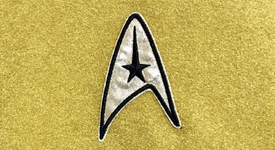
Star Trek uses symbols to convey a lot of things, but none captures the eye or imagination quite like the delta. In the years since The Original Series first aired, fans have tried to determine the meaning behind the various insignia shapes we see in the show. To most, it seems that the iconic delta shape is some sort of ship assignment patch meant to represent the U.S.S. Enterprise .
Some arrive at this conclusion because they see various Starfleet personnel wearing a number of different insignia. However, like any puzzle without a key, it’s impossible to precisely interpret the meaning of these other insignia.
The hidden key to the puzzle was finally uncovered a few years ago. The discovery was a memorandum written by producer Robert H. (Bob) Justman to costume designer William Ware (Bill) Theiss . The subject? STARSHIP EMBLEMS.
A copy of that memorandum has been digitized from the Gene Roddenberry Star Trek Television Series Collection (held in the Library Special Collections division of the Young Research Library at UCLA in Irvine, California) and is shown below:
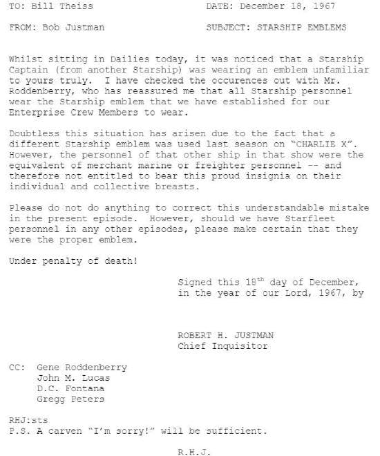
This memo, written during the production of the episode "The Omega Glory," and referencing Captain Ron Tracey, nullifies the long-held assumption that Starfleet assigned different insignia shapes to starships during TOS. Theiss’ inclusion of an alternate insignia for the Exeter 's captain and chief medical officer, unfortunately, downplays how genuinely ubiquitous the delta insignia is within the Star Trek universe. As a result, fans of the series are left with conflicting visual information regarding the meaning of the insignia worn throughout the original series.
Nearly 50 years after Bob Justman wrote his memo, we now have the opportunity to clarify the use of each and every Starfleet uniform insignia used in TOS. With a wee bit of Scotty's ingenuity, and a pinch of Vulcan logic, the complete picture of what Gene Roddenberry envisioned for the delta insignia should snap into focus.
There are six Starfleet duty insignia used in The Original Series:
- Starship Duty Insignia (Fleet personnel emblem)
- Spacecraft Duty Insignia (Auxiliary Fleet/ Merchant Marine personnel emblem)
- Outpost Duty Insignia (Outpost and Colony personnel emblem)
- Cadet Duty Insignia (Starfleet Academy student emblem)
- Starbase Duty Insignia (Headquarters, Space stations, Drydocks, and Ground installation personnel emblem)
- Fleet Command Insignia (Senior field commander personnel emblem)
In the Star Trek universe, the delta emblem is a direct descendant of the vector component of the old NASA (and later UESPA) logos in use during Earth’s space programs of the 20th and 21st Centuries. Those symbols were worn by some of the first space explorers and adorned uniforms and ships during humanity’s first steps into the final frontier.
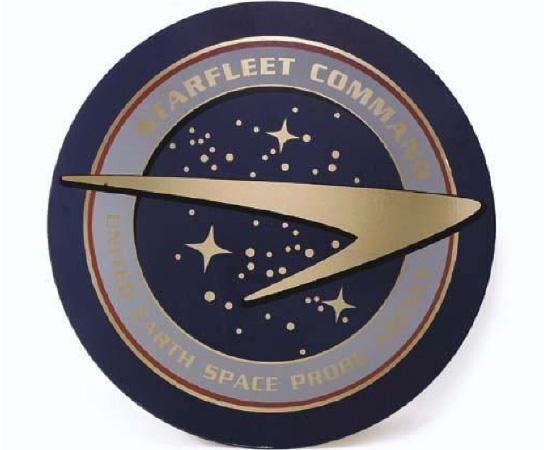
United Earth Space Probe Agency integrated with Starfleet as the leading United Earth space exploration service.
The delta insignia was first drawn in 1964 by costume designer William Ware Theiss with input from series creator Gene Roddenberry. The delta — or “Arrowhead” as Bill Theiss called it — has evolved into a revered symbol and one that's synonymous with Star Trek today.
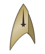
The delta also conveys information about the wearer’s duties aboard ship using a series of division symbols. When paired with a distinctive, elongated “star,” the insignia represents someone assigned to the Command division aboard ship. When it displays the “planet” symbol, it represents the Sciences division, a stylized “e” stands for Engineering (later Operations), and a red “Swiss Cross” is worn by starship personnel assigned to the Nursing Corps.

Captain James T. Kirk wearing the Starship Duty Insignia, Command Division.
Let’s continue our study of Star Trek ’s insignia with personnel assigned to other starships that are wearing the delta insignia.
Before we knew about this memo, we assumed that each ship had its own unique insignia, but there are problems that theory doesn't account for. For instance, does it bother you, or at least seem odd to see the surly guys in Starbase 11’s Officer's Club (in the episode "Court Martial") giving “their captain” a hard time over the presumed death of their mutual friend Ben Finney? Or, to see deceased crew members aboard the U.S.S. Defiant (in the episode "The Tholian Web") wearing the delta insignia?
If different starships had different symbols, why weren't they wearing them? Simple. The memo makes it clear that those Starfleet officers are not assigned to the Enterprise ; they are simply wearing Starfleet’s standard-issue Starship Duty Insignia.
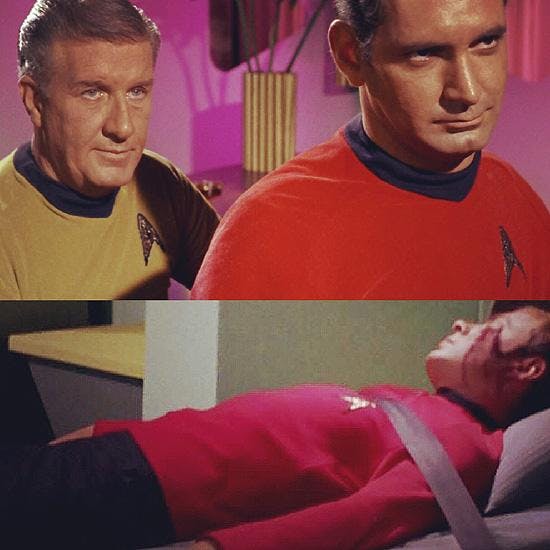
Non-Enterprise Starfleet personnel in Starbase 11’s Officer’s Club in Court Martial, and Below: Deceased U.S.S. Defiant crew member wearing the Starship Duty Insignia in "The Tholian Web."
By now, you might be saying, “What about U.S.S. Exeter ’s Captain Ron Tracey and his chief surgeon, Dr. Carter?” As these two insignia patches are the error being addressed in the memo, they need no further explanation. They alone are the anomaly (an anomaly Theiss never repeated), which led to the misconception that every ship has its own assignment insignia.
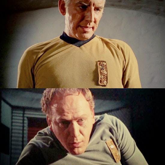
Above: Captain Ron Tracey of the U.S.S. Exeter, and Below: his CMO, Dr. Carter.
As you can see here, Theiss thoughtfully, if erroneously, provided both officers with unique assignment insignia patches, and in keeping with his fastidious reputation, insured both patches included their appropriate division symbols.
Early in TOS, we get our first look at non-delta insignia. In the episode "Charlie X," Antares ’ Captain Rampart and his first officer are wearing the Spacecraft Duty Insignia, which indicates that they are assigned to an auxiliary spacecraft serving in Starfleet's Merchant Marine Corps — just as Justman points out in his memo.
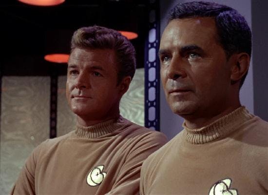
Antares' Captain Rampart, and his XO wearing the Merchant Marine Spacecraft Duty Insignia.
Not long after that, we get a look at another new insignia. The Outpost Duty Insignia is worn by Starfleet personnel assigned to outposts on the very edge of Federation space, the frontier. This emblem is characterized by a gold spikelet against a black background. Warning: Do not put yourself in a situation where this insignia goes on your uniform. Personnel wearing this badge never seem to live happily ever after.
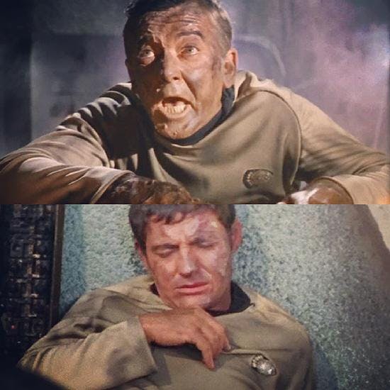
Outpost Crew from "Balance of Terror" & "Arena" pictured wearing the Outpost Duty Insignia.
A few episodes later, the Enterprise takes shore leave and Kirk reminisces about his days at the Academy. Worn by students attending Starfleet Academy, the Cadet Duty Insignia is characterized by a pewter colored, smaller version of the Starbase Duty Insignia.

Second Class Midshipman Finnegan wearing the Cadet Duty Insignia.
First seen in "The Menagerie," the Starbase Duty Insignia is worn by personnel assigned to Federation Starbases, which include Starfleet Headquarters, space stations, drydocks, and other ground installations. The emblem, which is devoid of any departmental symbol, is a stylized representation of an “Evening Starflower” (a flowering plant native to the western hemisphere of Earth).
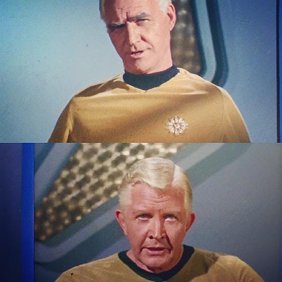
Above: Admiral James Komack of Starfleet Command - Sector 9, and Below: Admiral Fitzpatrick.
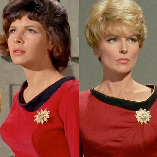
Miss Piper, assistant to Commodore Mendez, and Lt. Areel Shaw Starbase 11 JAG Officer wearing the Starbase Duty Insignia.
So how does Commodore Wesley in "The Ultimate Computer," or Commodore Decker in "The Doomsday Machine," fit into the spectrum of Starfleet insignia?
Well, let’s talk about commodores for a moment. A commodore is a flag officer rank, one position above captain. A starship captain usually commands a single vessel, but a commodore ordinarily commands more than one ship. Usually, commodores command a group of ships (either close to their flagship or distant), or in the case of TOS, they normally command a starbase.
In charge of evaluating the operational performance of the M5 computer while it's in total control of a starship, Commodore Wesley sits in temporary command of the U.S.S. Lexington to lead a battle fleet in war games against the Enterprise . Throughout the episode, Commodore Wesley continues to wear his Starbase Duty Insignia, while the Lexington crew would have been wearing the delta.
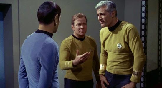
Commodore Bob Wesley in the transporter room briefing Captain Kirk and Mr. Spock about the M5 computer.
Finally, we come to one of my favorite characters ever — Commodore Matt Decker in "The Doomsday Machine." We saved him for last because we could only properly discuss his insignia and what it means after we talked about Starfleet’s other symbols first.

William Windom as Commodore Matt Decker
Unlike Commodore Bob Wesley, who was only in temporary command of the Lexington , Matt Decker is a Flag Officer with permanent field command of a starship. In fact, he's the only Flag Officer we see in Star Trek with a field command. As a consequence of Commodore Decker's rank and status as Commander of the U.S.S. Constellation (his flagship), he wears the Fleet Command Insignia denoting his status as a Flag Officer in the field. If we had seen Commodore Decker's crew (may they rest in peace), we would have seen the delta shape insignia in use on their uniforms. Commodore Decker's own first officer would have held the rank of Captain and worn the Starship Duty Insignia.
It should be noted that "The Doomsday Machine," which was filmed early in Season 2, is not referenced in Bob Justman’s memo. Some speculate that Decker’s absence from the memo is further indication of the inconsistent use of emblems in Star Trek , but that presupposes that the production staff missed that detail. However, the very existence of the Justman memo, and a whole forest of others just like it, demonstrates that the opposite is true.
The production team of Star Trek worked diligently to ensure that every aspect of the future they were busy creating held up under scrutiny. Gene Roddenberry was notoriously rewriting scripts himself to ensure no less than exactly what he wanted ended up on-screen, and that fastidious nature permeated the entire production staff. That Decker’s unique emblem is not mentioned in the production memo indicates that his particular insignia isn't an error at all; but represents something else.
Check out Commodore Decker's insignia. Remember that when Theiss created the insignia for Captain Ron Tracey, he went out of his way to ensure it was emblazoned with a Command Star department symbol. Commodore Decker has no such departmental symbol in his insignia patch, which places it in the same design lineage as the Starbase Duty Insignia, which is also devoid of any departmental symbol.
At this point in Star Trek , we’ve seen a number of flag officers; but they have all worn the Starflower shape, which indicates assignment to a starbase, while Matt Decker alone in TOS series serves as a flag officer in permanent command of a starship. He is wearing an insignia that conveys his unique status, the Fleet Command Insignia, and if you look closely, you'll see that Matt Decker’s emblem is visually related to the Starbase Duty Insignia. Decker’s insignia is a stylized representation of an individual petal from the same “Evening Starflower” emblem that comprises the starbase symbol. This insignia isn't mentioned in the production memo because it's not an error at all.
Hopefully, by now, you can see how consistent the Star Trek costume department really was in their use of insignia, and that Bill Thiess never repeated the error he made during "The Omega Glory" after it was pointed out by the memo.
Returning to the delta, Roddenberry and Justman intended it to be a very special symbol that communicates something important. The insignia worn on Starfleet uniforms is the equivalent of the badges worn by U.S. Service members — to show how they serve, not where they serve. Both men served with distinction in World War II. Roddenberry was an Army Air Corps pilot and Justman was a radio operator in the Navy. In the air and at sea, they understood the value of visual communication. In uniform, they themselves carried those values on their chests, on their collars, and on their sleeves. Twenty years after they wore their own various insignia, they helped to create something new — a symbol to inspire others. In the 1960s, the Starfleet delta had far more in common with the golden pin awarded to a NASA astronaut than a simple mission patch, and it was intended to equal that proud emblem in both use and sentiment.
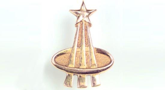
The NASA Astronaut Pin. There are two versions of this pin, a silver pin awarded to those who complete their training, and a gold pin awarded only to astronauts who have flown in space.
The delta proclaims that the person wearing it has achieved the goal of every cadet entering the Academy, and the dream of many a devoted fan — to serve aboard a starship and set sail in an endless sea of stars.
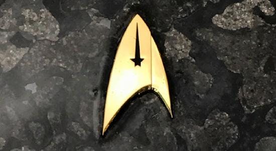
Starfleet Insignia Badge, Command Division from Star Trek Discovery
They used to say if man could fly, he'd have wings. But he did fly. He discovered he had to.
Captain James T. Kirk
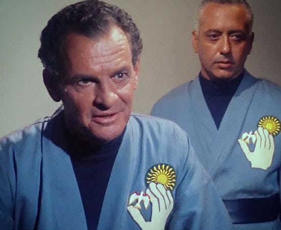
I am grateful to have an experienced and learned group of expert Star Trek fans who helped with the research on this article — Steve Fronczek, Creative Services Manager, ANOVOS; Lieutenant Commander Michael J. Quigley, United States Navy; and Dayton Ward, Star Trek author.
Get Updates By Email
This article was originally published on October 7, 2018
John Cooley is a lifelong Star Trek fan.
- Behind The Scenes
- Star Trek 101
Starfleet insignia
- View history
The Starfleet insignia or Starfleet delta was an asymmetrical, arrowhead-shaped emblem used by Starfleet . This symbol was used on every Starfleet badge and was displayed on starship hulls , installations , uniforms , and equipment, such as screws and screwdrivers .
- 1.1 Alternate reality
- 1.2 Mirror universe
- 1.3 Parallel and future versions
- 2.1 Background information
History [ ]

NASA insignia
This arrowhead shape has roots in history, beginning with a basic form on the logo used NASA in the 20th and 21st centuries , the United States military space command ratings badge and unit insignia, and on UESPA exploration vessels, such as the Friendship 1 , in the 21st century .

United Earth insignia
Building on that legacy, the United Earth Starfleet of the 22nd century used a simple forward-facing "pointer" shaped pennant, with a round backdrop. The original design for the Starfleet uniform of that era did not include this symbol, unless it was a crewperson assigned to Starfleet Command , who wore the insignia as their assignment patch on the left shoulder. In a later uniform revision of the 2160s , personnel wore the Starfleet patch on their right shoulder as well as the left shoulder assignment patch. ( ENT : " First Flight ", " These Are the Voyages... "; TNG : " The Royale ")
Shortly after the founding of the United Federation of Planets in 2161 , a solid silver delta was worn on the left breast of the uniform , with individual assignment patches worn on both shoulders. ( Star Trek Beyond )
After the 2160s, Starfleet slightly changed its insignias. The forward facing "pointer" shaped pennant remained the main logo for all of Starfleet, however Starfleet adopted different insignias for a different part of the fleet such as Starships and installations. For Starships. a new arrowhead delta design was adopted. This new arrowhead was the iconic Starfleet delta and was used only used on Starships. This design was used continuously until at least 2255 or 2256 , when the right side of the delta was changed to be outlined and slightly separated from the rest of the arrowhead. ( DIS Seasons 1 and 2 ; SNW Season 1 ; Star Trek: The Original Series ; Star Trek: The Animated Series ; Star Trek: The Motion Picture )
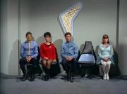
Personnel sit in front of a 2260s Starfleet pennant
The main logo of Starfleet was modified by 2256, with the left side of the insignia shortened. This simplified pennant was still used to display on Federation starships, and some installations, though it was not used on uniforms. ( TOS : " Court Martial "; ENT : " In a Mirror, Darkly ", " In a Mirror, Darkly, Part II ")

Three variants of the Starfleet insignia on uniforms aboard the USS Discovery ( 2257 )
The arrowhead delta insignia of Starships remained on the uniforms of officers and enlisted who served on starships. It came into usage for much of Starfleet's exploration division in the early to mid- 23rd century . ( TOS : " Court Martial ")
A starburst insignia was used by flag officers and administrative support staff of fleet headquarters and starbases . The regular Starfleet arrowhead insignia remained the standard identification for Starfleet from the late 2250s to at least 2265 . ( TOS : " The Cage ", " Court Martial ", " The Doomsday Machine ", " The Omega Glory "; ENT : " In a Mirror, Darkly, Part II "; Star Trek ; DIS : " The Vulcan Hello ")
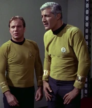
Two variants of the Starfleet Insignia based on rank and division, seen aboard the USS Enterprise ( 2268 )
By the mid- 2270s , while some installations such as Epsilon IX station , maintained their individual assignment patches, Starfleet Command began adopting the Starship arrowhead design for all of Starfleet. ( Star Trek: The Motion Picture ; Star Trek ; Star Trek Beyond ) Specifically, the command division insignia, with its five-pointed star contained in the arrowhead, was most often used, although a version omitting the internal star gained prominence as well. This symbol was now pointed up when worn on the chest or shoulder of uniforms, as well as displayed in signage, and facing fore when used as hull decoration on ships. This symbol eventually phased out all assignment patches by the late 2270s, and remained in use for some Starfleet divisions well into the 24th century . The metal badge version of this symbol became Starfleet's first combadge as well. ( Star Trek II: The Wrath of Khan ; TNG : " Yesterday's Enterprise "; VOY : " Friendship One ")

Two variants of Starfleet insignias worn on uniforms on the USS Enterprise -D (2365)
In the 2340s , a more stylized version of the symbol, the familiar arrowhead without any internal symbology within the shape, and mounted on an oval field, was incorporated into uniforms. A metal badge of this emblem, again serving as a combadge , was worn on the uniform chest. This symbol also became common in starship hull pennants. ( TNG : " Encounter at Farpoint ", " Family ")

Two variants of the Starfleet insignia worn on uniforms, as seen on the USS Cerritos (2380s)
By the 2370s , a newer version was created for use as a combadge , with a stylized trapezoidal background. Starship hull pennants of this era began using a simplified version of the arrowhead alone, without a background. ( Star Trek Generations ; DS9 : " The Search, Part I "; VOY : " Caretaker "; Star Trek: Insurrection ) Starfleet adopted the simplified silver version as part of the uniform used in the early 2380s, alongside continued use of the version used in the 2370s. ( LD : " Second Contact "; PIC : " Nepenthe ")
In 2383 , some Starfleet personnel wore a hollow, outlined version of the arrowhead in silver with two dark, irregular stylized vertical trapezoids behind it. ( PIC : " Maps and Legends ") This is similar to a version of the insignia used in several alternate timelines around 2390 onward, which used vertical gold bars as the backing. ( TNG : " All Good Things... "; DS9 : " The Visitor "; VOY : " Timeless ", " Endgame ") In 2378 , one of these "alternate future" combadges was brought into the prime timeline by a future version of Kathryn Janeway , where it remained alongside other anachronistic advanced technology used to bring the USS Voyager home early. ( VOY : " Endgame ")
By 2399 , this design had been adapted with the trapezoids in dark silver, and now only descending from arrowhead. By 2402 , the combadge had been revised slightly, with the color of the trapezoids restored to gold.( PIC : " The Last Generation ")
By 3190, a solid chrome background with 2 golden triangular shapes (one bigger than the other), making up the arrowhead, placed on top with a silver, curved, bottom. It also had markings on the right-hand side to show the wear's rank, following the same pattern as the pips on the collar (number and colour). it was also the wear's Tricom badge . This insignia was also used on robotic droids such as Darts used on USS Discovery . ( DIS : " Scavengers ") An insignia, similar to that used in the 24th Century, was used on EV suits .
Alternate reality [ ]
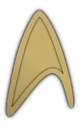
In the alternate reality created by Nero 's incursion, Starfleet had done away with the assignment patches by the 2250s. Instead, the fleet was united behind a gold arrowhead, slightly modified from the assignment patch of the USS Kelvin , with a shallow arrowhead indentation on the inside (as seen on dress uniforms ). The insignia used on starships was a silver arrowhead with a hollow division symbol inside the arrowhead, similar to the assignment patches used aboard the prime timeline's USS Enterprise . ( Star Trek )
By 2379, Starfleet was using an insignia similar to the one used from the 2340's to the 2360's in the Prime timeline. ( DIS : " Terra Firma, Part 1 ")
Mirror universe [ ]
In the mirror universe , a dagger impaling the Earth was the symbol of the Terran Empire , and, as such, was used as the insignia of the Imperial Starfleet . ( ENT : " In a Mirror, Darkly ", " In a Mirror, Darkly, Part II "; DIS : " Despite Yourself "; TOS : " Mirror, Mirror ")

Parallel and future versions [ ]
In the Barash -created false-future illusion experienced by William T. Riker in 2367 , the symbol used in the Starfleet combadge consisted of the arrowhead, either silver or gold, with four horizontal bars behind indicating the rank of the individual by the number of bars that were gold or silver. ( TNG : " Future Imperfect ") This version was also in use in an alternate quantum reality visited by Worf in 2370 . ( TNG : " Parallels ")
In several alternate timelines observed by Starfleet personnel, new variations of this symbol existed. In the 2390s and 25th century , Starfleet personnel were known to wear a hollow, outlined version of the arrowhead with two irregular stylized vertical trapezoids behind it as their badge. ( TNG : " All Good Things... "; DS9 : " The Visitor "; VOY : " Timeless ", " Endgame ") One of these combadges was brought back in time to 2378 in the prime universe by a future version of Kathryn Janeway , where it was left behind alongside other anachronistic technology. ( VOY : " Endgame ") This design was in use aboard the USS Dauntless in 2384 of the prime timeline. ( PRO : " A Moral Star, Part 2 ")
Further in the future, 29th century Starfleet had a rotated version of the arrowhead shape, with the bottom half filled in with a mirror of the top point of the shape. In 29th century timeship hull decorations, the arrowhead was shown pointing backwards from the direction of motion for the first time, possibly because of the vessels' capability for time travel . ( VOY : " Future's End ", " Future's End, Part II ", " Relativity ")

Appendix [ ]
Background information [ ].
Division insignia used during most of TOS
From the Star Trek Encyclopedia (4th ed., vol. 1, p. 365), " The distinctive arrowhead symbol used on Starfleet uniforms was first created by Star Trek: The Original Series costume designer William Ware Theiss for the " The Cage " in 1964 . Three versions of the original symbol were created, used for command personnel, science specialists, and engineering staff. (A fourth version, featuring a red cross, was occasionally worn by Christine Chapel .)" Another version, which appeared only in "The Cage", had a unique symbol of a box, open on the wearer's left, with a "C" shape inside. Only two crewmembers were seen wearing this unique insignia; both were on the bridge with one standing like a guard at the turbolift doors, and the other standing at times next to Captain Pike's chair. This unique insignia's meaning was never mentioned on screen; it was dropped in the second pilot, " Where No Man Has Gone Before ", and never appeared again.
Following the original Star Trek series, it was generally assumed that the arrowhead symbol was unique to Enterprise , and that other starships had different insignia for their uniforms." This misunderstanding may have arisen from a costume error in " The Omega Glory ", which officers on the USS Exeter were shown having their own unique insignia, but the intention was for all ships to use one symbol. A memo from Robert H. Justman dated 18 December 1967 clarified the policy around the arrowhead emblem , stating " all Starship personnel wear the Starship emblem that we have established for our Enterprise Crew Members to wear, " meaning that the arrowhead was always meant to be the emblem for all of Starfleet. Further, the crew of the Antares was the " equivalent of the Merchant Marines or freighter personnel " and other emblems should be counted as production mistakes. [1] Nevertheless, the two-part Enterprise episode " In a Mirror, Darkly (episode) " depicted the USS Defiant as having its own distinctive insignia.
Reference works , such as the Star Trek: The Next Generation Technical Manual (p. 3), suggest that the Starfleet-wide adoption of the Enterprise emblem was probably to honor the ship and her crew for their successful and historic five-year mission . Considering that one of Star Trek 's long-held influences is the Age of Sail, it may be a reference to the British Royal Navy's adoption of Nelson Chequer – the particular coloration of the ships of Admiral Horatio Nelson – on all of its ships after the Battle of Trafalgar . In a form of fact emulating fiction (and vice-versa), the US Air Force Space Command badges have a delta arrowhead very similar to the 1960s-designed Enterprise insignia, while the United Earth Starfleet insignia seems to be a deliberate synthesis between the TOS era pennant and the NASA logo. Several other space agencies (Roscosmos, JAXA, CNSA, ISRO) use a variation of the 'vector' shape in their logos as well.
Fletcher's revised division insignia seen in TMP
The Star Trek Encyclopedia further notes: " This changed in Star Trek: The Motion Picture , when a modified emblem, designed by Robert Fletcher , was used not only on Enterprise crew members, but on all Starfleet personnel. We therefore assume that at some point after the original Star Trek series, the Enterprise emblem was adopted for the entire Starfleet. The feature film insignia (in a couple of variations) was used for the movies set in the Kirk era, as well for Star Trek: The Next Generation flashback sequences involving Picard's cadet days. Yet another variation was created for Star Trek: The Next Generation 's first season by Theiss, in conjunction with Rick Sternbach and Mike Okuda . This version was also used on Star Trek: Deep Space Nine . Most recently. Starfleet officers wear a version designed by John Eaves and Bob Blackman , first seen in Star Trek Generations . Additionally, two hypothetical future versions have been seen. One, designed by Okuda, was seen in " Future Imperfect " and " Parallels ", while another, designed by Eaves, was used in " All Good Things... " and " The Visitor ". Still more variants were added for the Kelvin timeline for Star Trek and Star Trek Into Darkness . "
The 29th century insignia is referred to as the "far future Starfleet" symbol in the Star Trek Sticker Book , and was designed by Richard James and Rick Sternbach. (p. 14)
Several patches were sold off on the It's A Wrap! sale and auction on eBay. [2]
Following the announcement of the logo of the United States Space Force , a division of the Department of the Air Force, a number of sources noted its similarity to the Starfleet insignia, though others pointed out that the design appeared to based on the logo of the Air Force Space Command , which was phased out in place of the new Space Force. [3]
- 1 Star Trek: Discovery
Who Created The Star Trek Logo & What Do Its Variations Represent?

"Star Trek" has some of the most recognizable iconography in all of sci-fi, from the hulking image of the Starship Enterprise to the pointy ears of the Vulcans. Even just one look at the "Star Trek" logo — that basic arrowhead-esque shape containing a star with one elongated point inside — is enough to conjure countless memories of the adventures seen throughout the franchise. In fact, it's such an iconic component that some fans may have never stopped to wonder where exactly it comes from and what it's supposed to represent.
The "Star Trek" logo that everyone knows and loves — also commonly referred to as the "Delta" — was created in 1964 by the costume designer for the original series, William Ware Theiss. Theiss contributed a lot to the look of early "Star Trek," and his development of the "Delta" insignia to denote members of Starfleet on their uniforms quickly became the franchise's most enduring symbol. In the years since, the insignia has evolved and shifted into several distinct variations, each of which carry their own in-universe meaning.
There are a couple major Starfleet insignia variations
While the exact look of the Starfleet insignia has changed with just about each new entry into the "Star Trek" canon, it has just about always retained its core arrowhead shape. However, even dating back as far as the original series from the 1960s, the symbol contained within each variation of the arrowhead has actually been used to denote the specific division of Starfleet that the corresponding individual is a part of.
Of course, the most popular variation and the one most commonly seen today is the logo with the star inside. This version is commonly used to denote a Starfleet employee who is a member of the command division. Most of the major characters who make up the crew of various starships, from Spock to Captain Picard, are part of the command division, hence why it's the most common variation.
"Star Trek: The Original Series" further introduces three other major variations. The one with two overlapping circles signifies a member of Starfleet's sciences division, the one with a spiral inside represents the operations division, and, finally, the one with a red cross contained inside belongs to medical personnel. Other "Star Trek" projects have introduced the occasional new variant, but these four comprise the most well-known versions in canon.
The Starfleet insignia takes inspiration from a surprising place
It's been established that William Ware Theiss developed the Starfleet logo for "Star Trek: The Original Series," but some fans may still be wondering about its canonical origin. Where did the arrowhead symbol come from in-universe and why does it represent Starfleet? As it happens, the in-universe history of the Starfleet symbol and some of the pieces of inspiration Theiss drew from in the real world are one and the same.
The bulk of the "Star Trek" timeline that fans see takes place far into the future beyond the real-world present day. As such, it's frequently suggested that Starfleet as an organization grew out of Earth's space-based initiatives and programs from our real-world history. Indeed, there's a clever link between NASA and Starfleet in terms of their logos. Simply take the NASA logo and focus solely on the diagonal-pointing red "V" shape. Adjust it slightly so that the "V" is pointing upwards, and the resulting shape resembles the basic outline of the Starfleet symbol. To make this connection stronger, the franchise's United Earth insignia hews even closer to the NASA design in terms of composition.

Starfleet Insignia: Evolution of the Star Trek Delta Shield
U.S.S. ENTERPRISE NCC -170I LEGEND Colors shown near insignias DIVISIONS listed with each insignia or color band identifies the division assignment of the wearer. indicate base colors of uniforms that the insignias have been commonly worn with. THE FIRST PILOT Mission designation: "The Cage" (1965) Commander: Captain Christopher Pike NCC-1701 1965 COMMAND SCIENCES OPERATIONS THE SECOND PILOT Mission designation: "Where No Man Has Gone Before" ( 1966) Commander: Captain James T. Kirk* :A A A NCC:(700 19686 COMMAND SCIENCES OPERATIONS Despite Kirk's tombstone in this episode reading "James R. Kirk". STARFLEET INSIGNIA EVOLUTION OF THE STAR TREK DELTA SHIELD On the original television series, all members of the starship Enterprise were seen wearing arrowhead-shaped patches on their uniforms. In combination with the symbol shown within it and the base color of their outfit, they helped identify that crewperson's department or division on the ship. As originally conceived, each starship in Starfleet had its own uniquely designed insignia patch. But as shown in the V'ger Incident told in The Motion Picture, Starfleet had adopted the insignia of the Enterprise to use universally across all Starfleet uniforms, starships and starship markings. This infographic presents that insignia, also known as the "delta shield", in the various forms it appeared on uniform tops in nearly fifty years of Star Trek, from the unsold pilot through to The Next Generation, various time streams, and alternate universes. THE ORIGINAL SERIES 1966-1969 COMMAND SCIENCES OPERATIONS MEDICAL THE ANIMATED SERIES 1973 -1975 AAA NCC-1701 1971 COMMAND SCIENCES OPERATIONS THE MOTION PICTURE and its sequels 1979 -1991 -O :A A A A A A ADMIRALTY COMMAND SCIENCES MEDICAL ENGINEERING OPERATIONS SECURITY Mission designation: "The Wrath of Khan" 1982 ENLISTED/TRAINEE OFFICER Refit: 1979; A: 1987 ENLISTED TRAINEE COMMAND MEDICAL OPS (HELM, ENGINEERING) OPS (COMMUNICATIONS) OPERATIONS (SECURITY) CADET THE NEXT GENERATION and beyond 1987-2004 MISSION: "Future Imperfect" (TNG) MISSION: "All Good Things..." (TNG) MISSION: "Future's End" (VOY) 1996 Standard Version 1 Standard Version 2 1987 1990 1994 1995 THE ALTERNATE REALITY UNIVERSE 2009-2013 NCSATO STARFLEET U.S.S. KELVIN 2009 DUTY UNIFORM DUTY UNIFORM DUTY UNIFORM DUTY UNIFORM COMMAND SCIENCES OPERATIONS MEDICAL V. ACADEMY COLLAR PIN ACADEMY JUMPSUIT ACADEMY STARFLEET UNDERSHIRT STARFLEET DRESS UNIFORM DRESS UNIFORM DRESS UNIFORM ADMIRALTY COMMAND SCIENCES OPERATIONS Design & Graphics : FRANKPEPITO.com
You may also like...

For hosted site:
For wordpress.com:
US Space Force explains why its logo isn’t a Star Trek ripoff
Similar symbols have been in use long before the tv show.
By Jon Porter , a reporter with five years of experience covering consumer tech releases, EU tech policy, online platforms, and mechanical keyboards.
Share this story
:format(webp)/cdn.vox-cdn.com/uploads/chorus_asset/file/20108145/200722_F_GO452_0001.jpg)
An official logo and motto for the United States Space Force have been revealed , following the announcement of its official seal back in January , and flag in May . The organization’s motto is “Semper Supra,” which is Latin for “Always Above,” while the logo itself is based around a delta shape that’s been the focus of some mockery thanks to its similarity to Starfleet’s logo from Star Trek.
Defenders of Space Force’s seal were quick to point out that its actual inspiration appears to be the shield for Air Force Space Command . The official US Space Force Twitter account points out that the shape has been been in use by space organizations as far back as 1961. Star Trek, meanwhile, debuted in 1966.
So what about the other elements of the logo? The star in the middle is meant to symbolize Polaris, otherwise known as the North Star, the core values and guiding light for the organization. The two spires are meant to look like a rocket launch, while the four beveled elements at the bottom represent the four armed forces supporting the space mission. Around the edge there’s a silver border, signifying “defense and protection,” and the black background is the blackness of space, obviously.
“The black area embodies the vast darkness of deep space,” Space Force’s official Twitter account cheerfully notes , “Some feel fear and dread but we prefer to be inspired and stand up to the challenge.”
:format(webp)/cdn.vox-cdn.com/uploads/chorus_asset/file/20108148/200722_F_GO452_0002.png)
Space Force is the sixth branch of the US military alongside the Army, Marine Corps, Navy, Air Force, and Coast Guard.
Apple opens the App Store to retro game emulators
Tesla reportedly abandons plans to make a less expensive $25,000 electric vehicle, the matrix is coming back for a fifth movie, denis villeneuve is doing dune 3, how much macbook is enough macbook.
More from Tech
:format(webp)/cdn.vox-cdn.com/uploads/chorus_asset/file/25184511/111323_PlayStation_Portal_ADiBenedetto_0013.jpg)
Sony’s portable PlayStation Portal is back in stock
:format(webp)/cdn.vox-cdn.com/uploads/chorus_asset/file/23925998/acastro_STK054_03.jpg)
The Nintendo Switch 2 will now reportedly arrive in 2025 instead of 2024
:format(webp)/cdn.vox-cdn.com/uploads/chorus_asset/file/19336098/cwelch_191031_3763_0002.jpg)
The best Presidents Day deals you can already get
:format(webp)/cdn.vox-cdn.com/uploads/chorus_asset/file/25289959/Command_Line_Site_Post_Dylan_Field_Figma.jpg)
Interview: Figma’s CEO on life after the company’s failed sale to Adobe

- Upload Logo
- Sign Up
- Most Popular
Trek Logo PNG Vector
Trek logo png icon vector. we have 77 free trek logo png, transparent logos, vector logos, logo templates and icons. you can download in png, svg, ai, eps, cdr formats..

Trek Bicycle Corporation Logo

Star Trek - Original Series - Command Insignia Logo

Star Trek (Movie 2009) Logo

Star Trek Logo

Trek World Racing Logo

Emblem Star Trek Logo

Trek Bicycle Logo

Star Trek Enterprise Logo

Star Trek Voyager Logo

Pro Trek Logo

Benelli Trek 1130 Logo

Leopard Trek Logo

Star Trek TNG Logo


Star Trek The Next Generation Season 1 Logo

Star Trek - The Original Series Logo

Star Trek - Klingon Logo

Star Trek - The Next Generation Logo

Gay Star Trek Logo

Star Trek Strange New Worlds Logo

Star Trek - Voyager Logo

Star Trek - Deep Space Nine Logo

Trek USA Logo


Star Trek Logos: Starfleet Ships and Stations
Artwork by Kris Trigwell
NASA Spacecraft Spots 'Star Trek' Logo on Mars
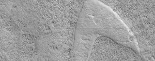
It looks like Starfleet is literally embedded on the planet next door: A dune in the shape of the famous logo from " Star Trek " appears prominently in a new picture from the Mars Reconnaissance Orbiter (MRO). Even Captain Kirk himself (actor William Shatner) has weighed in.
Don't expect to find Spock, Jean-Luc Picard or Michael Burnham squatting nearby, however. Just like the famous " face on Mars ," this Starfleet logo was produced by random chance, as wind, lava and other forces sculpted the Martian landscape.
"Enterprising viewers will make the discovery that these features look conspicuously like a famous logo," the University of Arizona, which manages the MRO HiRISE (High Resolution Imaging Science Experiment) camera, said in a statement . "You'd be right, but it's only a coincidence."
Related: The Weirdest Mars Discoveries by Opportunity and Spirit Rovers
The dune feature is located in Hellas Planitia, a large plain within the Hellas impact basin in the southern hemisphere of Mars. An interaction of dunes, lava and wind formed the chevron shape visible in the picture, according to the statement. MRO has photographed many other chevrons on Mars, so we're guessing this is not the first time it spotted one shaped like a "Star Trek" logo .
Scientists working with the HiRISE instrument have spent years studying the features they see in Mars images, and they think they have a good sense of how this particular shape came to be. The story starts with crescent-shaped sand dunes where wind and surface interacted.
Hey @starwars! Will you hurry up your Rebel Scums? 🙄 We beat you! 😉😝👇🏻 https://t.co/b53KxKlAlj June 13, 2019
Then came lava. Eruptions spilled the molten substance across the area surrounding the dunes, but it wasn't thick enough to cover them entirely. And when the lava cooled, the sand dunes remained, "stuck up like islands," according to the statement.
Get the Space.com Newsletter
Breaking space news, the latest updates on rocket launches, skywatching events and more!
"However, they were still just dunes, and the wind continued to blow," the statement continued. "Eventually, the sand piles that were the dunes migrated away, leaving these 'footprints' in the lava plain . These are also called 'dune casts' and record the presence of dunes that were surrounded by lava."
While the "Star Trek" feature is a coincidence, we can truly say that MRO has "lived long and prospered" (as the Trekkie saying goes) at the Red Planet. The orbiter has been sending back high-resolution imagery for 13 years, well past its design lifetime. It serves as a vital communications relay for NASA's Curiosity rover and InSight lander and is expected to support the Mars 2020 rover mission when that craft lands on the Red Planet.
- Huge HiRISE Photo Release Reveals Mars' Beauty
- Photos: Mars Volcano Views Revealed by Spacecraft
- There's a Strange Cloud on Mars Right Now, and It's Just Hanging Around
Follow Elizabeth Howell on Twitter @howellspace . Follow us on Twitter @Spacedotcom and on Facebook .
Join our Space Forums to keep talking space on the latest missions, night sky and more! And if you have a news tip, correction or comment, let us know at: [email protected].

Elizabeth Howell (she/her), Ph.D., is a staff writer in the spaceflight channel since 2022 covering diversity, education and gaming as well. She was contributing writer for Space.com for 10 years before joining full-time. Elizabeth's reporting includes multiple exclusives with the White House and Office of the Vice-President of the United States, an exclusive conversation with aspiring space tourist (and NSYNC bassist) Lance Bass, speaking several times with the International Space Station, witnessing five human spaceflight launches on two continents, flying parabolic, working inside a spacesuit, and participating in a simulated Mars mission. Her latest book, " Why Am I Taller ?", is co-written with astronaut Dave Williams. Elizabeth holds a Ph.D. and M.Sc. in Space Studies from the University of North Dakota, a Bachelor of Journalism from Canada's Carleton University and a Bachelor of History from Canada's Athabasca University. Elizabeth is also a post-secondary instructor in communications and science at several institutions since 2015; her experience includes developing and teaching an astronomy course at Canada's Algonquin College (with Indigenous content as well) to more than 1,000 students since 2020. Elizabeth first got interested in space after watching the movie Apollo 13 in 1996, and still wants to be an astronaut someday. Mastodon: https://qoto.org/@howellspace
NASA gets $25.4 billion in White House's 2025 budget request
'Interstellar meteor' vibrations actually caused by a truck, study suggests
NASA's Curiosity Mars rover begins exploring possible dried-up Red Planet river
Most Popular
By Robert Lea April 03, 2024
By Andrew Jones April 03, 2024
By Jesse Emspak April 03, 2024
By Mike Wall April 03, 2024
By Daisy Dobrijevic April 03, 2024
By Elizabeth Howell April 02, 2024
By Mike Wall April 02, 2024
By Jeff Spry April 02, 2024
By Cassandra Runyon, David Hurd April 02, 2024
- 2 NASA picks 3 companies to design lunar rover for Artemis astronauts to drive on the moon
- 3 'Star Trek's' Sonequa Martin-Green says goodbye to 'Discovery' (exclusive interview excerpt)
- 4 James Webb Space Telescope gets to the heart of a smoking starburst galaxy (images)
- 5 The world's largest digital camera is ready to investigate the dark universe

The Evolution of the Romulan Emblem
by Jörg Hillebrand and Bernd Schneider
Obscure TOS Emblem TNG-Style Emblems Nemesis-Style Emblems Picard Emblems Addendum: Ni'Var Emblem Conclusion
Romulans appeared in over 50 Star Trek episodes and movies altogether. On many of these occasions we could see a Romulan emblem. The very first emblem is kind of obscure and could only be seen in TOS: "The Enterprise Incident". The familiar emblem is a bird-of-prey supposedly holding the planets Romulan and Remus in its claws. It first showed up in TNG: "The Neutral Zone". After that, it could be seen in many variations with switched colors green and blue, with different colors, with variations of the shapes and letters, and sometimes without the letters. The emblem was finally updated to a stylized and monochrome version for "Star Trek Nemesis".
This article outlines the development of all variations of the Romulan emblem.
Obscure TOS Emblem

Although it may be just a decoration or a pictogram denoting a certain section of the ship, there is one reason why it was likely intended to be the Romulan emblem indeed. It looks remarkably similar to the Klingon symbol that had premiered just a few episodes earlier, in "Elaan of Troyius". It is even composed of the same colors. So whoever created this supposed Romulan emblem had a good intention to give this race more distinctiveness, but should have come up with something much more original to that end. Yet, perhaps the set designers deliberately made it look like the Klingon trefoil. The latter can be found on the ship's hull and may have been recognizable in the episode (the Romulans are using Klingon D7 cruisers in this episode). So the Romulan emblem may have been made to look similar. A possible retroactive in-universe explanation is that the logo symbolizes the supposed short-lived alliance of the Romulans with the Klingons in the 2260s. The colors and their arrangement were taken from the Klingon trefoil, while the unknown individual Romulan emblem may have contributed the hexagonal shapes. Hexagons can be seen all over the Romulan ship in this episode, and probably not by mere coincidence.
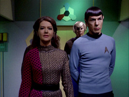
Interestingly, the regular hexagon can already be seen on a Romulan helmet in TOS: "Balance of Terror", while elongated coffin-shaped hexagons appear as the cross-section of the bridge in the same episode and, in many places, on Vulcan in TOS: "Amok Time".

TNG-Style Emblems

"I knew of the logo in 'The Enterprise Incident.' Although I often tried to preserve elements from the original series, in this particular case, I thought it was too similar to the Klingon logo. I had an artist named Monte Thrasher design the predatory bird for the TNG Romulan logo."
Two large plexiglass panes with the emblem on white ground were fabricated for TNG. The first variant is visible in nine episodes. The second one is slightly larger and shows up in two episodes.
The first appearance of the smaller panel (and of any variant of the Romulan logo) is in TNG: "The Neutral Zone" in the background of the Romulan Warbird bridge. It is barely possible to say which part of the emblem is blue and which is green. We believe that the right half is blue, as will be confirmed in later appearances of the same panel. On some other types of logos, the two colors green and blue are switched. In later episodes we will also see that the gray/white part of the plexiglass panel has a slight pattern like a brick wall that is turned by 90 degrees. This is best visible in "Face of the Enemy". The writing on the emblem is recognizable for the first time in "Contagion". We can see an E-shaped letter on the left. The location of this "E" indicates the orientation of the lettering, which is mirror-inverted on many other variants. The bird's (right) blue wing has a green outline, and vice versa, as we can clearly see e.g. in "The Mind's Eye" or "Redemption". Furthermore, the whole emblem has a white border.
The plexiglass pane can be seen in TNG: "The Pegasus" with an unusual green lighting.

Monochrome TNG-style emblems also show up twice in "Star Trek: The Final Frontier" (set in 2286). The first one can be seen on Caithlin Dar's mask. The second one can be spotted on a sign in Paradise City, beside the Klingon and the Federation emblems. Including the then new logo in the movie was the obvious choice, as it had just been established for the Romulans on TNG, albeit 80 years later in the timeline.

Similar monitor emblems appear on the Defiant in DS9: "The Search I", with the orientation as in the remastered version TNG-R: "Birthright II". These emblems show up whenever the ship is cloaked but not on red alert.

The first one (variant 18a) is colored and is placed on a trapezoid label. It can be seen in Enabran Tain's room on the Warbird and in the adjacent corridor. A still smaller version of this logo appears on a Romulan device in DS9: "Inter Arma Enim Silent Leges". We can't recognize any details on the screen caps, but the scan of the label gives away that there is an additional Romulan letter on the emblem, on the very left. It can also be seen that the left half of the emblem is olive green now, whereas the left planet is still plain green.

"Star Trek Nemesis" is known for introducing a new style of Romulan emblems . However, we can also still see the TNG-style emblem in the movie, on a monitor on the Enterprise-E. We can't really identify if there is any text, but this could be another occurrence of variant 19.

Unusual emblems
The Cardassians usually display symbols of other aliens in the "true" colors, or in simplified colors. In the sixth and early seventh season of DS9, however, we can see strangely colored Cardassian variants of the Romulan, the Klingon and the Federation emblem on a couple of occasions. It appears that the Cardassians adapted the enemy emblems to their pastel color palette.

Uniform insignia
The TNG-style Romulan uniforms already existed in TNG: "The Neutral Zone" and "Contagion". But the Romulans didn't yet have badges based on the emblem. In "The Neutral Zone", the two officers wear drapes, with emblems that roughly resemble the Romulan logo from "The Enterprise Incident" but perhaps not on purpose. In "Contagion", the Romulan insignia is recycled from Q's post-atomic horror uniform from "Encounter at Farpoint".

The familiar Romulan insignia first appears in TNG: "The Enemy". At the time of TNG, there are two color variants. The higher-ranking officers consistently wear a copper emblem and sash, whereas the lower ranks wear silver gray.
The Romulans who always wear the copper sash are:
- Tomalak in all his appearances in "The Enemy", "The Defector", "Future Imperfect" and "All Good Things"
- Sela in all of her appearances except "The Mind's Eye"
- The Romulan commander in "Tin Man"
- Taibak in "The Mind's Eye" (who seems to be in command, rather than Sela)
- Romulan commander in "The Chase"
- Major Rakal und Toreth in "Face of the Enemy"
- Sirol in "The Pegasus"

The Romulans in "The Next Phase" have silver/gray badges, probably because it is only a science ship. In "Timescape", all Romulans have silver gray insignia, as we never see the commander.

The TNG-style copper insignia don't show up again in the later series. For DS9, collar rank symbols were introduced, making the sash insignia expendable.
Discovery emblem

Strange New Worlds emblem
Prodigy emblem.

Nemesis-Style Emblems
Nemesis senate sculpture and insignia.

We can see Rick Sternbach's "Nemesis"-style emblem in ENT: "Kir'Shara", "Babel One", "United" and "The Aenar" (set as early as 2154) too. It appears on the Romulan uniforms that Enterprise simply took over from the movie, just like the CG cityscape.

Nemesis screen and floor emblems

"I designed the floor layout and the bird sculpture, but someone else did the central bird graphic that was printed on adhesive vinyl and applied to the floor. I don't remember who did that one."

We can't make out the TNG-style logo in "Nemesis" at all. Also, the two stylized new Romulan emblems have in common that they never appear in a specific color or even in multiple colors; they are always plain silver or gray.
Promotional logo and variations

There is, however, a new wall decoration in the trilogy of "Babel One", "United" and "The Aenar" that features another variation of a stylized bird-of-prey. The engraved depiction on the wall panel clearly resembles the "promotion logo" from "Nemesis", although the proportions are not the same. Interestingly, the same wall element can be seen with yet another and even more stylized bird-of-prey depiction and without the planets Romulus and Remus when Reed and Tucker are aboard the Romulan drone ship in "Babel One" and "United". This was obviously done to obscure the Romulan origin of the ship (although the Romulan writing on the panels should give it away just as well).

Abramsverse emblems

Lower Decks emblems

The Nemesis-style emblem appears in a somewhat more detailed form on the vertically oriented ship in LOW: "I Have No Bones Yet I Must Flee" and on a D'deridex class in "Empathalogical Fallacies".

Picard Emblems
The political situation of the Romulans after the disaster of 2387 that destroyed the home system of their empire is unclear. The Borg cube known as the "Artifact" is in the possession of an entity called the "Romulan Free State". On the other hand, the secret police Tal Shiar still exists, although the Romulan Empire has collapsed. We can't tell whether the emblems displayed on and inside the Artifact belong to the Romulan Free State or to the Tal Shiar. Two decades ago, the latter used to have distinct emblems from the official Romulan state and government, emblems which are not the subject of this article. See Other Romulan Logos - Tal Shiar .
Notwithstanding the exact political situation, new Romulan emblems were created for Star Trek Picard. They still contain the bird-of-prey, but without the two planets in its talons, which used to represent the now destroyed Romulus and Remus.
Relief emblems

A similar but not quite the same relief logo appears on the uniforms of some Romulan guards, continuing the tradition from TNG and DS9. Commodore Oh has a similar emblem on her uniform belt, which could be a different, more reddish or copper color.
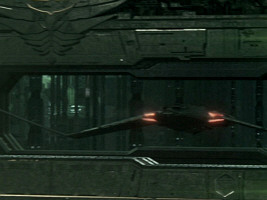
Finally, there are wall panels that very roughly resemble a bird-of-prey, comparable to the ones we already saw on Star Trek Enterprise.
Stylized emblem

Addendum: Ni'Var Emblem

Other Romulan Logos - communicator badge, Tal Shiar, Senate and more
Alpha and Beta Quadrant Emblems L-Z
Forgotten Alien Emblems
Some screen caps from TrekCore . Thanks to Ambassador/Ensign Q and to E.W.G. for suggestions pertaining to the origin of the TOS Romulan emblem and to Nathan for the hint about the Romulan hexagon in "Balance of Terror". Special thanks to Rick Sternbach for clarifying some issues regarding the "Nemesis" emblems and to Brad Wilder for redrawing the Picard emblems.

https://www.ex-astris-scientia.org/inconsistencies/romulan_emblem.htm
Last modified: 29 Sep 2023

© Ex Astris Scientia 1998-2024, Legal Terms
This website is not endorsed, sponsored or affiliated with CBS Studios Inc. or the Star Trek franchise.
Fleet Yards
File : Emblem of the Moscow City Police.svg
File history, file usage on commons, file usage on other wikis.
Original file (SVG file, nominally 641 × 1,049 pixels, file size: 460 KB)
Structured data
Items portrayed in this file, 12 march 2019.
- Emblems of the Ministry of Internal Affairs (Russia)
- Police in Moscow
- PD-RU-exempt (logos and emblems)
Navigation menu
- Milano Cortina 2026
- Brisbane 2032
- Olympic Refuge Foundation
- Olympic Games
- Olympic Channel
- Let's Move
Olympic Games Moscow 1980
- Highlights & Replays
- Medal Design
Moscow 1980 The Brand
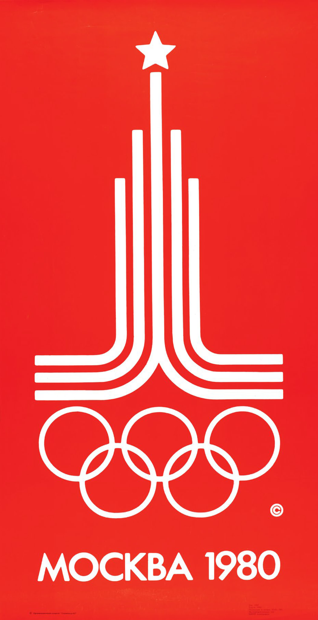
The official emblem was created by Vladimir Arsentyev. Above the Olympic rings, we find parallel lines in the shape of a pyramid and a five pointed star, which serves as a reminder of the flag of the Kremlin.

It featured the emblem of the 1980 Olympic Games in Moscow: a section of a running track rising into an architectural silhouette typical of Moscow and a five-pointed star topping the silhouette.
Discover the Games

IMAGES
COMMENTS
In the Star Trek universe, the delta emblem is a direct descendant of the vector component of the old NASA (and later UESPA) logos in use during Earth's space programs of the 20th and 21st Centuries.Those symbols were worn by some of the first space explorers and adorned uniforms and ships during humanity's first steps into the final frontier.
The Starfleet insignia or Starfleet delta was an asymmetrical, arrowhead-shaped emblem used by Starfleet. This symbol was used on every Starfleet badge and was displayed on starship hulls, installations, uniforms, and equipment, such as screws and screwdrivers. This arrowhead shape has roots in history, beginning with a basic form on the logo used NASA in the 20th and 21st centuries, the ...
The "Star Trek" logo that everyone knows and loves — also commonly referred to as the "Delta" — was created in 1964 by the costume designer for the original series, William Ware Theiss. Theiss ...
Emblem-atic. Oct 6. Nothing symbolizes Star Trek like the insignia worn by its Starfleet characters as seen on TV from 1966-present day. Midyear 2020 brought it to the forefront when the official U.S. Space Force emblem was unveiled to historically naïve cries that it "rips off" the Star Trek emblem. Over the years, many assumptions have ...
Star Trek Logos and Symbols, Artwork by Kris Trigwell » Star Trek Minutiae. The talented Kristian Trigwell (aka "Reverend") spent many months researching hundreds of logos, insignia, and symbols seen in every Star Trek series and movie, and then faithfully reproduced them as vector artwork. He also included a few original designs of his own.
Star Trek Logo PNG Vector Star Trek logo png icon vector. We have 53 free Star Trek logo png, transparent logos, vector logos, logo templates and icons.
This infographic presents that insignia, also known as the "delta shield", in the various forms it appeared on uniform tops in nearly fifty years of Star Trek, from the unsold pilot through to The Next Generation, various time streams, and alternate universes. THE ORIGINAL SERIES 1966-1969 COMMAND SCIENCES OPERATIONS MEDICAL THE ANIMATED SERIES ...
Contents. File:Trek Bicycle Corporation logo.svg. Size of this PNG preview of this SVG file: 512 × 294 pixels. Other resolutions: 320 × 184 pixels | 640 × 368 pixels | 1,024 × 588 pixels | 1,280 × 735 pixels | 2,560 × 1,470 pixels. The source code of this SVG is valid.
But the history of the emblem is long and confusing because, from the moment the creators of the debut film offered the audience a fantastic world, it has changed many logos. ... This Star Trek logo is similar to the Space Force emblem, not the other way around. Because the real military symbol appeared in 1961, while the designation for the ...
The Starfleet Command emblem in Star Trek Picard exists at least since 2384, es evidenced by the flashback to that year in PIC: "The End is the Beginning". ... This logo is aptly based on emblems that appeared in the TOS movies, rather than anticipating the version of the 24th century. Starfleet Command emblem in "Star Trek (2009)" See Also.
Jul 23, 2020, 1:46 AM PDT. An official logo and motto for the United States Space Force have been revealed, following the announcement of its official seal back in January, and flag in May. The ...
Trek logo png vectors. We have 77 free Trek logo png, transparent logos, vector logos, logo templates and icons. You can download in PNG, SVG, AI, EPS, CDR formats.
Federation Member: Bajor (Banner) Federation Member: Berengaria. Federation Member: Bolarus IX. Federation Member: Cetacean Embassy. Federation Member: Deneva Colony (Flag) Federation Member: Star Empire of Epsilon Indi (Seal) Federation Member: Star Empire of Epsilon Indi (Standard) Federation Member: Earth. Federation Member: Sol System Flags ...
The idea that the logo is indeed meant to be the emblem of the Klingon Empire (or that of the Klingon Defense Force) at the time is corroborated by an apparently wooden wall relief that serves as a torch holder in Kor's office. ... Black "Star Trek VI" emblems. For "Star Trek: The Undiscovered Country", two versions with a black emblem were ...
Rigel class Development Project Patch. Sequoia class Development Project Badge. Sequoia class Development Project Patch. Work Bee Development Project Patch. Deep Space Nine Outpost Emblem. Earth Spacedock One, 2192-2273. Earth Spacedock One, 2273-2385. 40 Eridani-A Shipyards. Copernicus Shipyards.
Some Space Force watchers were quick to point out the new logo's similarities to the arrow-like "Star Trek" insignia that the iconic science fiction TV series and film franchise has used for decades.
published 13 June 2019. NASA's Mars Reconnaissance Orbiter spotted a feature on Mars that looks like the famous "Star Trek" logo.(Image credit: NASA/JPL/University of Arizona) It looks like ...
Variant 01. The familiar Romulan emblem, the bird-of-prey supposedly holding the two planets Romulan and Remus, was designed by Monte Thrasher. Michael Okuda tells us about the motivation to create an all-new symbol: "I knew of the logo in 'The Enterprise Incident.'.
The logo or insignia of the Moscow Olympic Games of 1980, designed by Vladimir Arsentyev, was largely inspired by the Moscow State University, ... In the highest part of the facade there is a large shield or emblem of the Soviet Union, as well as the building of the Red Door Square, with an area of 144 square meters. ...
Emblem of the Moscow City Police.svg. From Wikimedia Commons, the free media repository. File. File history. File usage on Commons. File usage on other wikis. Metadata. Size of this PNG preview of this SVG file: 366 × 599 pixels. Other resolutions: 146 × 240 pixels | 293 × 480 pixels | 469 × 768 pixels | 626 × 1,024 pixels | 1,251 × 2,048 ...
The history of coats of arms and emblems goes back hundreds of years; the first coat of arms was instituted in 1179 by Count Gottfried of Anjou in Normandy. Nobility clans, cities and countries eventually approved their own coats of arms that narrated their history. The word emblem is derived from the German word erbe meaning heritage.
Poster. It featured the emblem of the 1980 Olympic Games in Moscow: a section of a running track rising into an architectural silhouette typical of Moscow and a five-pointed star topping the silhouette. Olympic Games.